Minimal Color, Maximum Impact: Easy Monochromatic Card Inspiration
by Mindy Eggen May 7, 2025

Hello crafty friends! Today I’m excited to share a project that proves you don’t need a rainbow of colors to make something beautiful. In this card titled “Minimal Color, Maximum Impact,” I’m keeping things simple and elegant by focusing on a monochromatic palette.

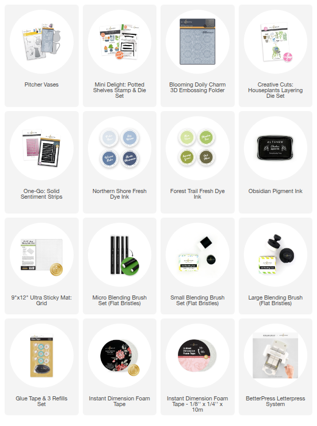
I’ll be using the Pitcher Vases Embossing Folder & Die Set along with the coordinating coloring stencils to bring subtle depth and dimension to my design. The added texture from the embossing folder paired with just a hint of soft ink blending really allows the details to shine without overwhelming the eye.

The color palette I’m using today is from the Northern Shore Fresh Dye Ink collection, which provides the most beautiful range of soft blue hues. These gentle tones are perfect for achieving a calming, monochromatic look that still feels elegant and polished.
I’ll start by die cutting the vases from white cardstock using the coordinating die. Once cut, I’ll place them into the Pitcher Vases Embossing Folder, carefully lining them up to emboss the detailed design right onto each shape. This adds instant texture and interest before we even begin coloring!

To keep everything secure while I work, I’m placing my die-cut vases on a 9″x12″ Ultra Sticky Mat: Grid. This helps hold both the pieces and the stencil in place. Then, using a small blending brush, I’ll lightly ink blend over the stencil with Icy Water ink, adding a soft wash of color. For a little extra dimension, I’ll deepen some areas with Winter Lake ink.
To finish off the stenciling, I’ll add a pop of green to the flower stem using Matcha Tea ink from the Forest Trail ink bundle. It’s the perfect soft contrast to the cool blues and brings the whole arrangement to life.

I’ll fill my vases with die cuts from the Creative Cuts: Houseplants Layering Die Set and Mini Delight: Potted Shelves Stamp & Die Set, using the same ink colors and a micro blending brush to maintain a cohesive look and tie everything beautifully into the soft blue tones of the vases.

For the background, I’m using the Blooming Doily Charm 3D Embossing Folder. I begin by ink blending my cardstock with Icy Water and Winter Lake using a large blending brush for a soft gradient. After embossing the panel, I lightly blend more ink over the raised design to enhance the texture and bring out the beautiful details.
I'll tie in a sentiment using the One-Go: Solid Sentiment Strips. The pop of black adds contrast and really helps the sentiment stand out against the soft monochromatic background.

Thanks so much for joining me today! I hope this project showed you how a minimal color palette can still create a big impact. Drop me a comment below if you have used a monochromatic ink palette like this.

SUPPLIES