Pink vs. Orange: Billowing Peonies Color Challenge!
Hi Altenew and color-loving friends! It's your girl Erica back on the Altenew blog and YouTube channel, hi!
Pink versus orange, that is going to be the question of today. Okay, let's back up a little first: Have you ever looked at one of your favorite stamps and thought, “No, that wouldn't look good in any other color than (insert color of your choice here),” but then forced yourself to try a very unusual one for you? That was me with these orange Billowing Peonies. I LOVE, LOVE, LOVE how they look in pinks, and I have a habit of using the same colors over and over. I have a tendency to be a bit of a one-trick pony, but I am working on using more colors. But just look at it in pinks!

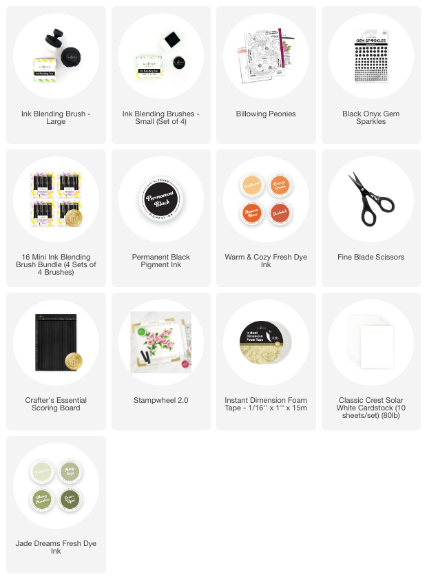
If you are now asking ‘why orange?' Well, first of, this Warm & Cozy Fresh Dye Ink bundle is pretty lovely, so while I'm not a huge fan or orange, unless we are talking sunrises and sunsets, I thought it would be worth going down the ‘let's just see what happens' route.

I must confess I was half-regretting it for the first two layers, but then all of a sudden, those orange layers started making sense and the flowers were coming to life! This was a test of ‘trusting the process' for sure and the process was right. Warm & Cozy orange peonies look BEAUTIFUL! This set, Billowing Peonies, is one of my absolute favorite sets ever from Altenew. It is so lovely, it really is.

After using the coordinating die cut on the flowers, I splattered a bit of Metallic Watercolor 14 Pan Set on it for extra sparkle and wow. I think I used the color Citrine or Copper to coordinate with the orange flowers, and it was a good choice! I think gold would have looked lovely too, but the more reddish one was perfect.
I had a bit of a trimming issue when I went to trim the peonies down to fit on a card base and things went all kinds of wrong. Wonky cuts, uneven sides and it was just a mess. In the end I trimmed off far more than I wanted, but at this point I wasn't going to start again, and ink blend another set of orange peonies, so I made it work! With what, do you ask? Instant Dimension Foam Tape of course, LOL. To raise up the image and create some depth and layers. This stuff is worth its weight in gold, for sure!

Sentiment wise I have used one from the Billowing Peonies stamp set and then cut it out with the coordinating die cut. This is raised up a little with some of the leftover Instant Dimension Foam Tape. I do love some height and layers!

For this card I have used the lovely Black Onyx Gem Sparkles for a touch of bling, and some extra texture and interest. The gems are added on the two different layers, some tucked in under the orange peonies, and some on top. It's all about creating interest and a tactile feeling when holding the card in your hands.
This was an experiment that definitely paid off, as I love how these gorgeous peonies look in both orange and pink. What color combo should I try next? I'm thinking of trying to work my way through as many as possible. I'm thinking these peonies heat embossed in gold, and the flowers in blended in blues might look amazing! Or totally crazy. Who knows?

I do hope you get a chance to watch the YouTube video too, I made a boo-boo in it (as per usual), and I show a little tip on how to really pivot before it's too late.

Thank you so much for stopping by today and exploring this new color combination with me. Orange Billowing Peonies for the win, I'd say for sure!
Lots of love and creativity,
Erica