Simplify Your Card Designing with This Easy Stenciling Tip
by Mindy Eggen April 3, 2025


Welcome, crafty friends! Mindy here, and I’m back with a fun stenciling tip that will take your projects to the next level! Plus, I’ve got an exclusive sneak peek at some brand-new products coming soon—you won’t want to miss it! Let’s dive in and get creative!
When I sit down to create, I like to make multiples of the same image but in different colors. This gives me flexibility and options when assembling my card, allowing me to mix and match for the perfect design!

Welcome to Creativity Unlocked, where we highlight a new product from each month's collection or a fan favorite from past collections!
Today, I’m featuring the Build-A-Garden Through the Tulips set! It’s perfectly sized for an A2 card front and features minimal layering, making it easy to clean and ink up again for multiple projects. A great choice for effortless yet stunning floral designs!

I ultimately chose the orange tulip for my design, but here’s a look at the other variations I created. Each one is beautiful in its own way, but something about the vibrant orange really popped against the card front! It’s not a color I typically reach for, but I love how it turned out.
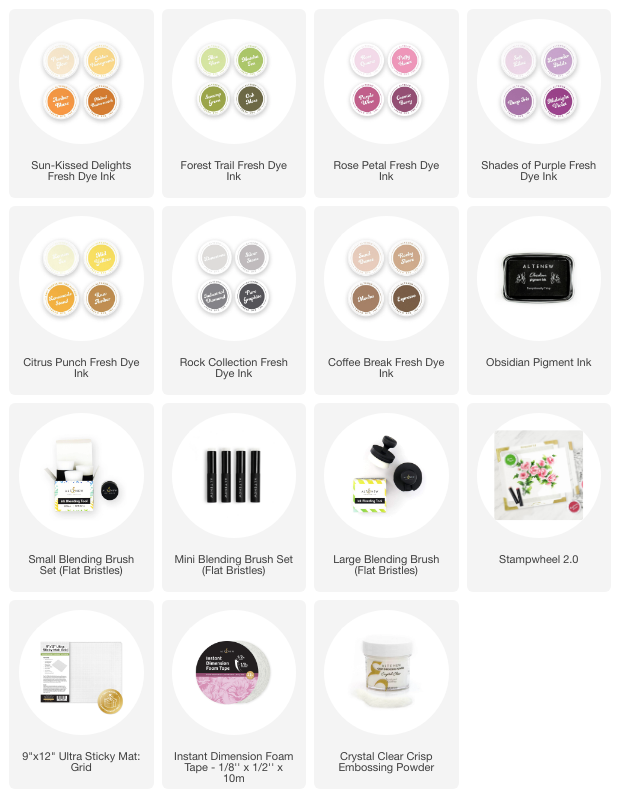
The ink collections I used are:
- Sun-Kissed Delights Fresh Dye Ink (my project)
- Rose Petal Fresh Dye Ink
- Shades of Purple Fresh Dye Ink
- Citrus Punch Fresh Dye Ink
- Forest Trail Fresh Dye Ink (leaves)
- Coffee Break Fresh Dye Ink

I could have added all four of these to a single card front, but by using just one image per card, I now have three more designs ready to go! This is a great way to stretch your supplies and create multiple beautiful cards with minimal extra effort.
There are so many great background options to choose from, but I decided to incorporate a few elements from the April release to complement my design. It’s always fun to mix and match new products for a fresh and creative look!
I started by die cutting an oval from the center of an A2 white panel using the Zero Waste: Oval Serenity die. To add texture and dimension, I then ran the panel through my die-cut machine with the Arched Foliage 3D embossing folder, creating a beautifully detailed background.

To enhance the texture, I lightly brushed over the background with a Large Blending Brush (Flat Bristles) and Silver Stone ink. Since it’s a 3D embossed design, the raised areas naturally pick up more color, creating beautiful depth and dimension on the card front.
I love adding dimension to my cards, so I used 1/2″ foam tape to pop up the frame. To keep everything even and seamless, I also added foam tape behind my flower, making it flush with the frame for a polished, layered look.

One subtle yet impactful detail on this card is the sentiment. I stamped it in Obsidian Pigment Ink and then heat embossed it with Crystal Clear Crisp Embossing Powder, adding a beautiful shine and crisp finish. It’s a small touch that makes a big difference in person!
I hope you'll give this a try next time you sit down to create!
-Mindy