Vibrant Floral Ink Blending with Layering Stencils
by Mindy Eggen November 10, 2026

Key Takeaways
Dimension Through Shade Variation: Blend across complementary ink families—mixing light blush foundations with deep red accents—to create realistic petal folds and depth.
Brush Size Determines Saturation: Use large blending brushes for soft initial background washes and switch to mini detailed brushes to pack saturated pigment into fine stencil openings.
Harmonizing Color Palettes: Ground vibrant floral heads by pairing them with multi-tonal, earthy foliage to prevent visual fatigue and create natural contrast.
Creative Mistake Recovery: If a coordinating die slips or misaligns, crop the image along the card edge instead of restarting to create dynamic, edge-to-edge movement.
Subtle Textured Backgrounds: Complement heavy, colorful focal points with neutral letterpress script or delicate splatters to avoid visual competition.
Hello friends, and welcome back! It's Mindy here for Altenew with another installment of my monthly creative series, Inking It Up with Mindy!
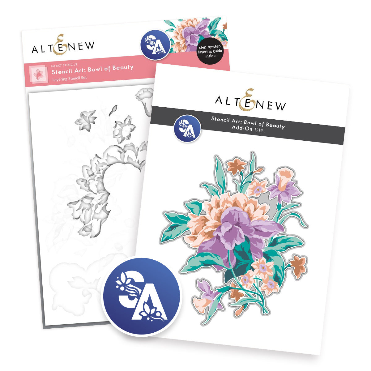
Today, we are exploring the art of floral ink blending with layering stencils—diving deep into vibrant color transitions, dimensional blooms, and a touch of crisp letterpress magic. For this project, I am featuring the Stencil Art: Bowl of Beauty set, a standout design that builds the most breathtaking, billowing botanical arrangement you have ever seen. If you love experimenting with ink combinations and dynamic textures, this is an absolute must-try technique for your paper crafting toolbox.
For today’s card, I stepped away from the expected pastels and chose an adventurous, high-contrast palette: warm pinks, saturated reds, and earthy, grounding greens. The result is a vibrant focal bloom that pops against a restrained, tactile background. Along the way, I also share how an accidental die-cutting slip turned into an opportunity to completely transform my card composition!


Did You Know?
Did you know that die-cutting your cardstock before you ink blend can save you from alignment heartbreaks?
Known among paper crafters as the "reverse stenciling technique," die-cutting the blank cardstock silhouette first allows you to lay your layering stencils precisely over the cut edges. Because the boundary of the die-cut aligns with the outer profile of the stencil, you eliminate the risk of accidental slippage in your die-cutting machine after spending time blending your colors!
Mastering Dimensional Ink Blending with Layering Stencils
One of the most rewarding aspects of using layering stencils is how effortlessly you can build realistic depth and contours using only ink and blending brushes.
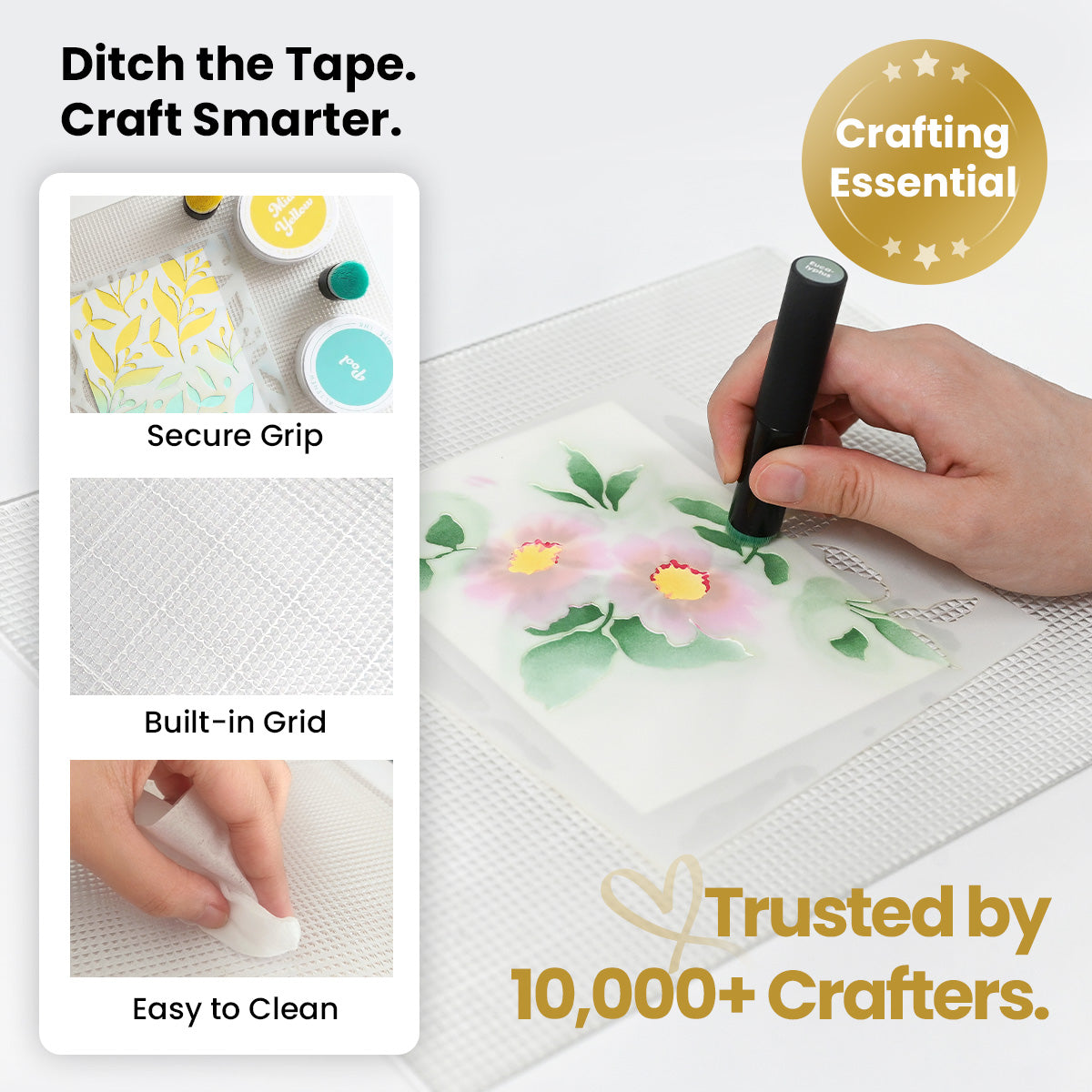
The Stencil Art: Bowl of Beauty & Add-On Die Bundle is especially well suited for this because of its wide, sculptural petals. Each successive stencil overlay builds upon the last, taking a flat wash of color and turning it into a dramatic, multi-tonal botanical illustration.
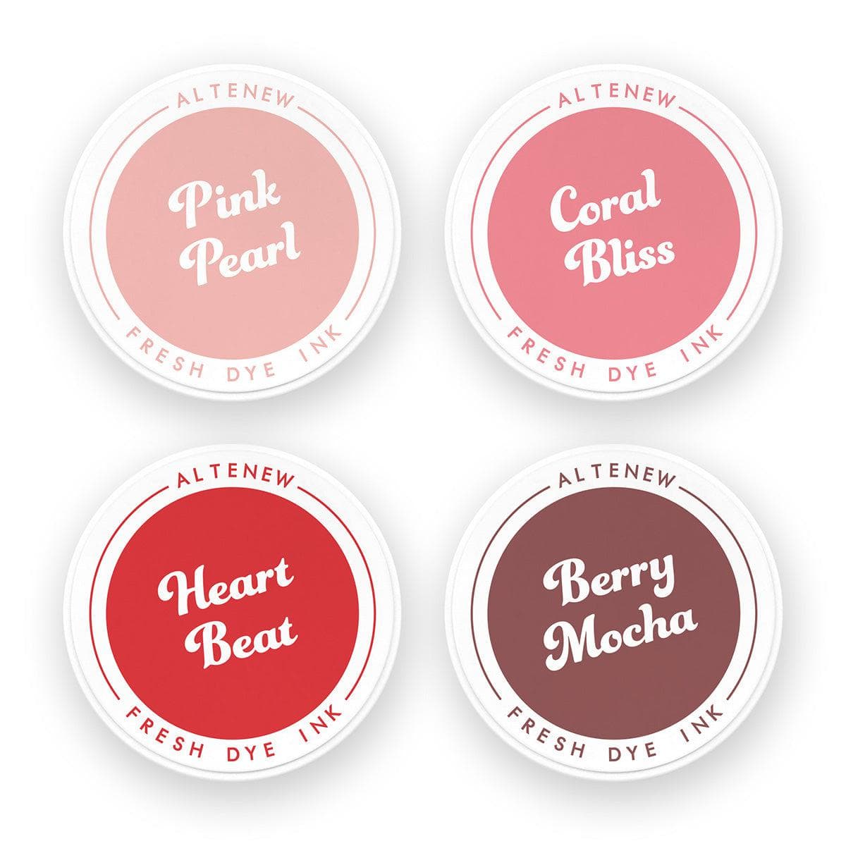
To achieve maximum depth for these blooms, I reached for both the Blushberry Bliss and Red Sunset Fresh Dye Ink collections:
The Base Layer: Lighter, translucent pinks establish the soft underlying shape of each petal without oversaturating the cardstock fibers.
The Midtones: Intermediate coral and berry tones bridge the gap between highlight and shadow.
The Accents: Rich, deep reds applied through the final stencil layers accentuate the petal crevices, folds, and overlapping intersections.
Don't hesitate to stretch your ink collection across sets! You are never locked into a single four-shade ink family. Blending across families introduces subtle temperature shifts that mimic natural garden petals in sunlight.

Selecting the Right Blending Brushes
Your tool choice directly impacts ink saturation:
Large blending brushes: Best for applying broad, seamless washes across large stencil cutouts with minimal wrist pressure.
Mini detailed blending brushes: Ideal for reaching inside tight, delicate stencil openings. Their compact, densely packed bristles allow you to concentrate deep pigment right at the base of the petals without blowing out your soft highlights.
Balancing Saturated Blooms with Earthy Green Foliage
When working with intense floral colors, surrounding foliage plays a critical structural role: it provides visual resting space and grounds the entire composition.
For the leafy elements, I pulled from the Jade Dreams and Green Valley Fresh Dye Ink collections to develop an organic, multi-layered look:
Misty Sage applied first across all foliage leaves creates a muted, velvety base.
Mossy Meadow and Green Opal introduce varied midtones across leaf ribs and stems.
Mountain Pine applied to the deepest stencil cutouts supplies the sharp shadow accents that define individual leaf shapes.
The earthy undertones of these cooler greens counterbalance the intense warmth of the pinks and reds. By carefully curating your foliage palette, you maintain crisp visual separation between blooms and greenery while ensuring the entire layout remains cohesive.

Fixing Alignment Mistakes: Turning Die-Cutting Slips into Creative Layouts
No handmade project goes perfectly every single time—and this card was no exception!
After completing all the ink blending layers, I lined up the coordinating die to cut the arrangement out. Unfortunately, the die shifted slightly inside the machine sandwich, chewing through one side of my finished image and leaving uneven margins.
Rather than throwing away the entire piece and starting from scratch, I treated the mistake as a design opportunity:
Off-the-Edge Framing: I trimmed away the ruined edge completely and aligned the cut border against the outer perimeter of an A2 card base.
Dynamic Movement: Allowing the oversized floral cluster to spill off the panel creates an asymmetrical crop, making the card feel modern, candid, and full of natural movement.
Cropping a large floral arrangement forces the viewer’s eye toward the intricate center blending and the delicate gold details rather than the outer card perimeter.

Crafting a Subtle Letterpress Background for Balanced Contrast
Because the floral cluster carries substantial visual weight, the background needed tactile texture without competing for attention.
The Making Moments Press Plate provided the ideal solution:
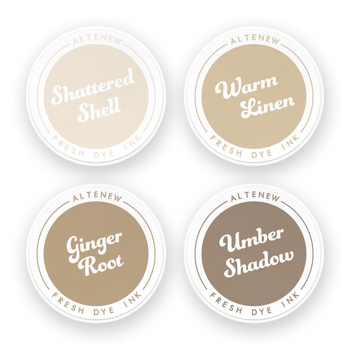
Delicate Letterpress Texture: Using the BetterPress system, I ran the delicate handwritten script plate using Shattered Shell ink from the Earth Tones collection.
Soft Contrast: The warm, muted gray-tan script leaves a crisp impression in the cotton cardstock that adds interest without stealing focus from the bold floral arrangement.
Dual-Use Flexibility: This press plate can also be paired with a hot foil system and metallic foil if you prefer a reflective sheen instead of a letterpress deboss.
To tie the card together, I flicked metallic gold watercolor splatters across both the finished floral die-cut and the letterpress panel. These fine, reflective specks catch the light and unify the focal element with the card front.

Assembling the Card: Sentiment Placement and Layered Dimension
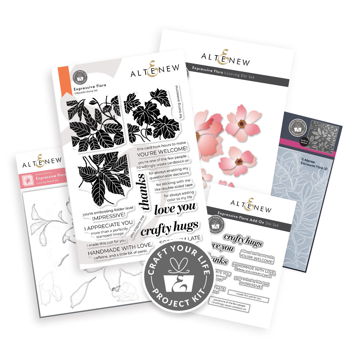
To complete the project, I selected an uplifting sentiment from the Craft Your Life Project Kit: Expressive Flora:
Crisp Sentiment Stamping: Using the Stampwheel 2.0, I stamped the greeting in Obsidian Pigment Ink onto heavy white cardstock and cut it with the matching die for a stark, razor-sharp finish.
Panel Assembly: The letterpress background panel was trimmed down to 3¾" x 5" and centered onto an A2 side-folding card base with double-sided foam tape, leaving a clean ⅛" white border around all sides.
Final Foam Mounting: Both the cropped floral arrangement and the sentiment were mounted with foam adhesive at varying depths. Placing the sentiment nestled into the bottom right-hand corner balances the weight of the floral die-cut without obscuring any of the detailed petal blending.
Final Thoughts & Creative Takeaways
Combining layered stenciling, cross-palette ink blending, and tactile letterpress impressions creates a multi-dimensional greeting card that feels luxurious and artistic. Remember:
Never feel confined to a single ink collection—mix and match shades to find unique depth.
Control brush density and pressure to let your cardstock breath under lighter layers.
When a die-cut shifts, grab your paper trimmer and discover an exciting new crop!
Check out the full video tutorial below to see every brush stroke, ink blend, and press pass in real time. What color palette will you try first with your layering stencils? Happy crafting!

SUPPLIES
|