Soft & Seamless Look with Magical Peony Press Plate & Stencil
by Mindy Eggen June 6, 2025

Hi friends! It’s Mindy here, and today I’m so excited to share a little inspiration using one of my new favorite combos — the Magical Peony BetterPress Plate and coordinating stencils.

In this project, I’m creating a soft, seamless look by using ink from a single-color family for both the BetterPress impression and the ink blending. This simple technique brings beautiful harmony to your card and lets the gorgeous floral details of the design really shine.

MAKE AN IMPRESSION
Start by inking up your Magical Peony BetterPress Plate using your chosen ink from the color family you’ll be blending with. I'm going to be using Amber Blaze from the Sun-Kissed Delights Fresh Dye ink collection. I love that this gives the base design a soft tone-on-tone look that coordinates perfectly with the blended colors later on.

BLEND WITH STENCILS
Next, place the coordinating stencils over the design. Using a light hand and blending brushes, apply the same ink (or other shades in the same color family) over the areas of the flower. This keeps everything cohesive and dreamy.
I like to start each stencil layer with my lightest shade, which in this case is Peachy Glow. I use a small blending brush to lay down a soft, even base of color.
Then, to add more dimension, I go in with Amber Blaze using a mini blending brush—this helps me apply color more precisely in the shadow areas.
To finish off each layer, I deepen the shading even further with Melted Butterscotch, applied with a micro blending brush. This tiny brush gives me full control over those tighter areas and really ties everything together with a beautiful gradient.

ASSEMBLING THE CARD
Even though the Magical Peony design fills a full A2 card front, I decided to trim my panel down to 2 ¾” x 4″. This gives the card a clean, modern feel with a generous white border — letting the artwork breathe and really stand out.
Before adhering it to the base, I added an additional layer of white cardstock behind the panel to create a subtle frame and give it more presence. Then I popped the whole piece up using foam tape for added dimension.
Tip: Don’t be afraid to trim down your beautifully detailed panels — a smaller focal point can actually make a bigger impact, especially when paired with clean layers and a simple layout.

For the sentiment, I used the One-Go Sentiment Strips 2 Plate, pressed in Obsidian Ink to create a bold, crisp contrast against the soft florals. I trimmed it out using the coordinating sentiment strip die, then adhered it across the card—slightly overhanging the image for a casual, modern touch that ties the whole design together.
Letting a sentiment strip slightly extend beyond the edges of your focal image adds a relaxed, handcrafted feel while still keeping your card clean and balanced.
Using one ink family for both the pressed image and blending keeps the design cohesive and calming. It’s also a great way to stretch your supplies — no need to reach for tons of colors! And if you’re a fan of clean and elegant cards, this soft blending approach really lets the floral artwork shine.
I had so much fun creating this card, and I love how easy it was to get such a polished result with just a few supplies. The Magical Peony BetterPress plate is truly stunning on its own but pairing it with soft ink blending makes it even more magical.
If you give this technique a try, I’d love to see what you create!

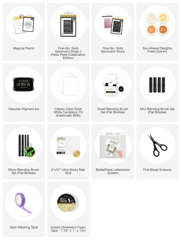
SUPPLIES