Fresh Dye Inks in Focus! Let’s Get Colorful with Erica for THREE Different Looks + VIDEO tutorial
Hi Altenew friends and fans! It's Erica back on the Altenew Blog and YouTube channel again, aren't you lucky, eh? (insert a big goofy smiley face here) Today I'm going to be getting inky with some fabulous Fresh Dye Inks and what we are going to do is use the same 3D embossing folder and layering stencils, but with different ink colors to show you a tone-on-tone look. This one is the Fairyland Floral 3D Embossing Folder, and coordinating layering stencils.

I actually have five cards to show you today, but in the video I will focus on just one. The ink blending part will be heavily featured to give you a bit of a deep-dive into getting the most of your Fresh Dye inks. I have a bit of a controversial opinion about the whole Full Set Syndrome that is spreading fast and furiously throughout the crafting community: You don't actually need every single color (GASPS OF HORROR CAN BE HEARD THROUGHOUT THE LAND!!)
I know, I know, I told you it's controversial, but hear me out: Your ink needs are yours and you need to be honest with yourself and your actual needs. Do you do a lot of florals? You will need a good set of greens for foliage, and whatever colors you like for your flowers. If you like geometric shapes, you might need to look at some greys or a bright pop of color. Some of us don't have unlimited space nor financial resources, and sadly real life takes away a lot of hours we could be crafty instead. Adulting is hard…
Card #1 – Golden Tones with Fresh Dye Ink
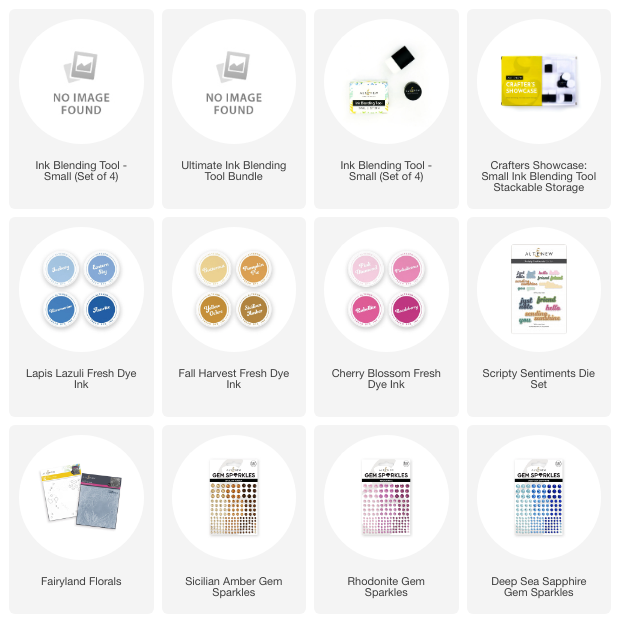
Ok, enough woe is me chit-chat, let's get to the first card. The original one that I ended up loving so much I went ahead and made a whole video about it and recreating two more, is made with the Fall Harvest Fresh Dye Ink. Those colors ended up looking like a golden glow!

This one is finished off with some coordinating Sicilian Amber Gem Sparkles and they compliment the colors from the Fall Harvest Fresh Dye Inks so well! Like perfectly!

Card #2 – Blue Hues with Fresh Dye Ink
In the video I'm using the Lapis Lazuli Fresh Dye Ink Bundle and I'm loving the shades of blue in it. Absolutely gorgeous, but then I am a blue kind of gal. All shades of it, really, but darker ones have my heart.

If you get a chance to watch the video, I go through some ink blending techniques that will help you get depth and dimension even on a one-layer card. It takes a bit longer to do it this way, but it is definitely worth the extra time, if you ask me.

Adding details with ink blending can be a bit tricky, but having some of the Micro Blending Brushes. I'm quite partial to the flat bristled brushes myself, but there are angled ones too.

For the card in the video, I have started with Iceberg Fresh Dye Ink for the first layer, and then depending on where I wanted details and depth, I have used the other colors in the Lapis Lazuli Fresh Dye Ink Bundle. I think my favorite shade is the Ultramarine Fresh Dye Ink, it's just the PERFECT shade of blue! If I could only have one blue ink pad, this is the one.

It's not super easy to explain with words how to ink blend and get details but I will give it a go: either you start with putting down your lightest color with a LIGHT touch, the point isn't to get as much ink on there as possible. All you want is enough color so the paper isn't white. Unless you want an ultra bold look, but that's for another day.

By adding more color slowly and methodically, build it up rather than plonk it on, you can create some really delicious depth and add so much dimension to what's essentially a pretty flat surface. It requires time, practice and a whole load of patience, but I can't stress enough how much it is worth it! In the video I go over some tips and tricks to bear in mind, as well as a rather genius masking tip!

The way I added color to this card is slightly different from the original card, but we don't have to do everything exactly the same, do we? I'm not good at that, so that's my excuse. To finish this blue wonder off I used some Deep Sea Sapphire Gem Sparkles.
Card #3 – Pretty Pinks with Fresh Dye Ink
Another card I did slightly differently too is the third card, where I used the gorgeous Cherry Blossom Fresh Dye Ink bundle.

This is my favorite pink ink bundle, there is no question. Cherry Blossom Fresh Dye Ink Bundle for the win! Just look at this other card I made using them, with the Billowing Peonies Stamp set and Layering Stencils.

How gorgeous are those pinks together? I can barely stand it! If you don't have the Cherry Blossom Fresh Dye Ink bundle and you are looking for a great pink ink family, take my word for it, this is the one.

Those pinks are popping! With this card it was a choice between Pink Tourmaline Gem Sparkles and Rhodonite Gem Sparkles and the Rhodonite ones won out. This is the only one out of the three where I have used two different colors of gems, for the blue and the yellow cards I stuck with the same shade of gems.

Ok, well, I think that's it from me for today, but I hope you get a chance to check out the YouTube video too. Let me know which one of these speak to you the most and also if you are a fan of the tone-on-tone look!

Have a great day and thank you so much for stopping by!
Lots of love and crafty hugs,
Erica