Color Mixing and Keeping Color Palettes Cohesive with Emily!
Hi friends! Emily Midgett here, and I have some supersized watercolor inspiration to share with you using one of the prettiest sets I've ever seen: Peony and Lilac Swag from the recent Altenew x The Mint Gardener Release!
Color Mixing and Keeping Color Palettes Cohesive
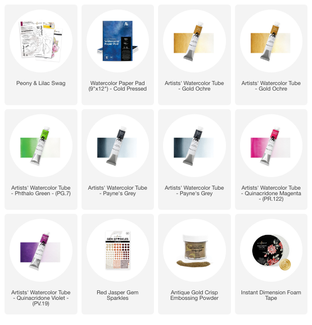
I am always up for watercoloring extra large floral bouquets, and these exquisite blooms were just begging to be watercolored. The colors in the Artistry by Altenew Watercolor Tubes are marvelous basics with which you can create a huge array of colors. I like to squeeze the tubes into empty watercolor half pans, then allow them to dry, and place them in one of the Altenew Watercolor Tins.

I love experimenting with color mixing with the pan watercolors, and I recently saw an artist on Instagram create a cohesive color palette by mixing small amounts of the same color into the rest of the colors for her project. I wanted to create a soft, almost shabby chic color palette, with warm olive greens, peachy pink peonies, and warm lilac accents, so I created a corresponding color palette by mixing and matching the Artistry by Altenew Watercolor Tubes, adding Gold Ochre to each of my main colors so that the warmth of the Gold Ochre would create consistent warm undertones throughout the project.
I began my project by heat embossing the main image from the Peony and Lilac Swag set in gold onto some Altenew Cold Press Watercolor Paper. I taped this panel and another plain A7 panel of watercolor paper onto two different watercolor boards in order to reduce warping.

I occasionally have a bit of a heavy hand when watercoloring, so I wanted to ensure that my large flowers would have some bright white highlights by doing some “watercolor reverse psychology” on myself. I mixed up a lovely warm green using Phthalo Green, Gold Ochre, and Payne's Grey, then added this warm green halo around the edges of the embossed image. This technique allows me to more clearly see the contrast between the darker green areas around the flowers and the flowers themselves, which helps me to keep the highlights on the flowers a bit lighter.
I used the same lovely green mixture to create a wet-on-wet background on the panel of A7 watercolor paper and allowed it to dry completely while taped to the board to minimize warping.

To continue my warm color palette, I created a mixture of Quinacridone Magenta and Gold Ochre for the large peony blooms, as well as Quinacridone Magenta, Gold Ochre, and Quinacridone Violet for the smaller flowers, varying the intensity of the violet to create some differentiation between the two flower varieties. After I had completed watercoloring and allowed the image to dry, I die cut it with the coordinating die.
The green halo helps the die cut pop even more beautifully on the watercolored background, I think!

I popped up the watercolored swag on the background using some Instant Dimension Foam Tape, then added a gold embossed greeting from the Peony and Lilac Swag set. I adhered the greeting with a double layer of foam adhesive so that it would have a bit extra height and add some more dimension and interest to the relatively simple card layout. Finally, I added a few sparkling gems from the Red Jasper Gem Sparkles set.
Well, that's all for my project today! Tip: If you find your color palettes are not quite as cohesive as you would like, try mixing small amounts of the same color into all of your color mixes. It really does create lovely, consistent undertones throughout your project!
Thanks so much for stopping by today, and have a marvelous day!
~Supply List~