Add Layers to Ink Blended Backgrounds: Eclipse Technique
by Erica Andersson July 29, 2026

Key Takeaways
Create Dimension: Trim your ink-blended background by 1/4 inch to create a built-in frame using your card base or glitter cardstock.
Master the Eclipse Technique: Die-cut large letters (like the Mega Alphabet Dies) directly from your background before applying dimension foam or double-sided adhesive.
Add Shadow Layers: Stack die-cut letters over glitter cardstock slightly offset to create an elegant "glitter shadow" effect.
Stamp Early: Stamp background sentiments before assembling raised layers to ensure crisp, clean impressions.
Hello Altenew friends and fans! I hope you are ready for some amazing layers, die-cutting, the eclipse technique, and gorgeous sparkle! It's your layer- and texture-loving gal Erica back on the blog today.
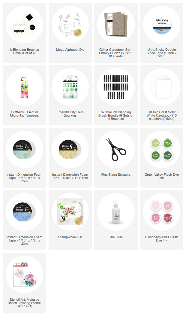
I’m sharing a card I made for my sister Amanda's July birthday—hence the giant "A" on the front! To create this look, I mixed and matched some of my absolute favorite supplies, including the Stencil Art: Majestic Roses Layering Stencil Set (7 in 1) and the Mega Alphabet Dies. Large letter dies are fantastic for adding quick layers, glitzy texture, and personal touches to custom handmade cards.
Crafting the Ink Blended Background
Choosing the Right Layering Stencils
Let's talk about the Stencil Art: Majestic Roses Layering Stencil Set (7 in 1). As soon as I saw this design, I fell head over heels. The image is stunning and creates an ideal base for building dimensional layers. (Tip: While it doesn't feature a coordinating die, ink blending the pattern onto cardstock gives you a rich canvas to work with!)
Selecting a Summer-Inspired Color Palette
For the color scheme, I aimed for a soft English country garden aesthetic with gentle pinks and lush greens:
My sister lives in an adorable Victorian cottage surrounded by plants and flower bushes, so these shades were perfect for her while bringing a bright, summer vibe to the overall design.

Adding Layers to Ink Blended Backgrounds: Step-by-Step
If you want to take your flat ink-blended cards to the next level, here are a few simple ways to add depth, framing, and texture without overwhelming your artwork.
Trim the Background Panel for an Instant Frame
Once your ink blending is complete, trim down your background panel just a smidge—about 1/4 inch or less. This simple step reveals the card base underneath, instantly creating a clean, professional border that grounds your design.
Add Sparkle with Glitter Cardstock and Foam Tape
To elevate the look further:
Matting: Add a layer of Smoky Quartz Glitter Cardstock behind your trimmed background panel to give your card a subtle sparkle frame.
Dimension: Place Instant Dimension Foam Tape between the card base and your background to make the design pop off the page.

Die-Cutting and the Eclipse Technique
Adding a die-cut sentiment directly out of an ink-blended panel is called the eclipse technique, and it adds incredible visual depth.
Prep Before Applying Adhesive
Pro Tip: Always die-cut focal elements (like the Mega Alphabet Die) out of your ink-blended background before applying double-sided adhesive or foam tape to the back!
Creating a Stacked Glitter Shadow Effect
To give the focal "A" letter extra height and interest:
Die-cut the letter "A" from the center of your ink-blended background.
Cut a few additional layers of the same letter from white scrap cardstock and stack them together using liquid glue.
Cut one final "A" out of Smoky Quartz Glitter Cardstock.
Offset the glitter layer behind your ink-blended letter to create an elegant, shimmering shadow.
(Curious about assembling these layers seamlessly without making a sticky mess? Be sure to check out the accompanying YouTube video for my quick assembly trick!)

Final Touches: Sentiment Stamping and Embellishments
Stamp Sentiments Before Final Assembly
It is crucial to stamp any direct background sentiments before assembling your raised foam layers. Stamping over raised or uneven surfaces can result in incomplete ink transfers.
For this card, I selected sentiment stamps from Mini Delight: Expressions Of The Heart and inked them with Industrial Diamond Crisp Dye Ink. A soft, neutral gray ink is a great alternative to solid black when you want a gentler, more sophisticated contrast. I chose the sentiments "You are my favorite" and "Love you", leaving space inside the card for the main birthday message.
Strategic Bling Placement
To finish the card, I added Emerald City Gem Sparkles (green is my sister's favorite color!). Rather than scattering gems randomly:
Arrange gems in visual clusters of three.
Mix and match three different gem sizes within each cluster.
Keep embellishments balanced so they enhance the ink-blended flowers without distracting from them.

Final Thoughts
I hope you enjoyed this layer-licious card tutorial and found fresh inspiration for your next paper crafting session! Whether you prefer clean, single-layer designs or love stacking textures like I do, these techniques are simple to adapt.
If you have your eye on the Stencil Art: Majestic Roses Layering Stencil Set, be sure to grab it as soon as it's in stock! It’s versatile, timeless, and takes up minimal space in your craft room while making a huge impact on your handmade cards.
Thank you so much for hanging out with me today—I’ll be back next month with more card-making shenanigans!

Frequently Asked Questions
What is the eclipse technique in cardmaking?
The eclipse technique involves die-cutting a shape or letter directly out of a patterned or ink-blended background panel, popping that die-cut piece up with foam tape, and adhering it back into the exact spot it was cut from. This creates a seamless, 3D dimensional effect where the pattern continues across the raised element.
How do you make ink blended backgrounds pop?
You can make ink blended backgrounds pop by trimming the panel slightly smaller than the card base, adding a glitter or foil cardstock mat, layering foam tape underneath for height, and using focal die-cuts with stacked shadow layers.