6 Ways To Elevate Your Handmade Cards
by Mindy Eggen January 22, 2025

Hello friends! It's Mindy Eggen back with more inspiration from the January 2025 release. Today I'm sharing in a video 6 Ways To Elevate Your Handmade Cards!
You can watch that video HERE.

All of these tips are probably things you already do but maybe never thought about or combined into one card project. From layering techniques to adding texture and dimension, these tips are perfect for crafters of all levels. I'll be using the Craft-A-Flower Carnation Layering Set for my project today but any layering die set will work.

Design Tip 1: Ink Blending
Ink blending is a versatile and fun technique that adds stunning gradients, depth, and dimension to your paper crafts. I start out with White cardstock and build up my color but you can always start with a light color cardstock as well.
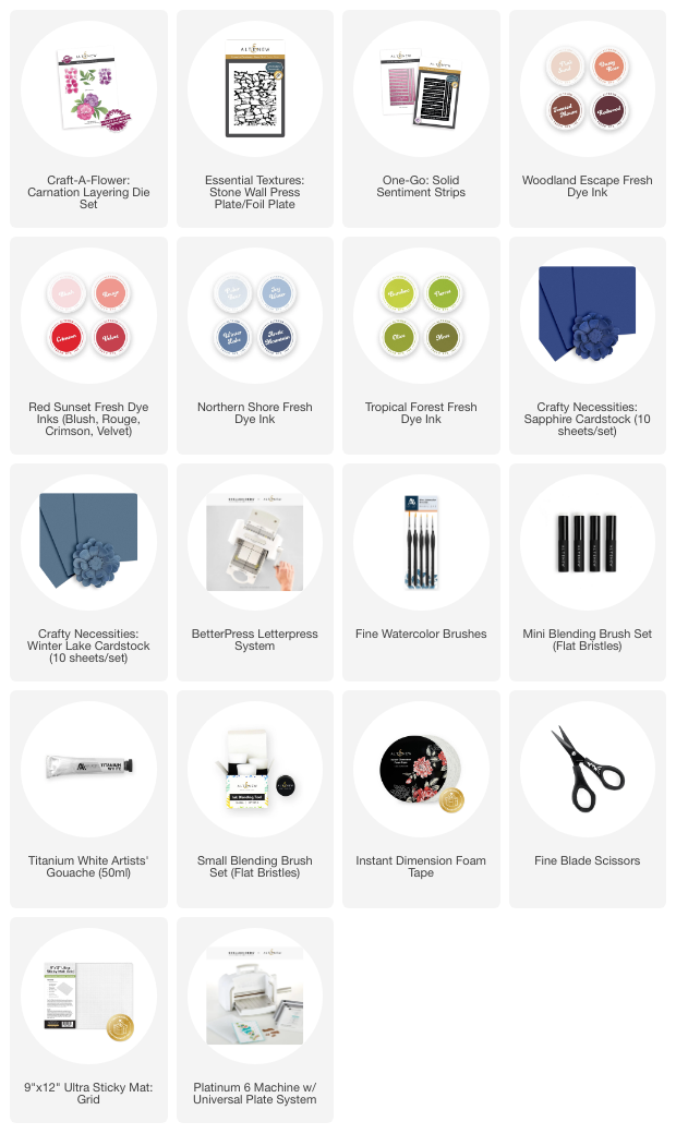
The color palettes I'm using are
- Tropical Forest Fresh Dye Ink Collection
- Woodland Escape Fresh Dye Ink Collection
- Red Sunset Fresh Dye Ink Collection
Design Tip 2: Soft Colors
Create stunning contrast by combining bold, rich tones with delicate, pastel hues. This technique adds depth, highlights key elements, and makes your designs truly pop which leads into my next tip.
Design Tip 3: Dark Background
The Winter Lake and Sapphire Cardstocks creates a striking background for the soft color palette of carnations.
Design Tip 4: Subtle Texture
Adding delicate textures and tone-on-tone colors can bring depth and interest to your projects without overpowering the design. The Stone Wall Press Plate and Winter Lake Ink is a great match for this.

Design Tip 5: Splatters
Splatters are a simple yet impactful way to bring energy, texture, and depth to your designs. The fun pop of Titanium Gouache stands out well against the dark background.
Design Tip 6: Foam Tape
Adding dimension to your projects can bring a whole new level of interest, and foam tape is the perfect tool to achieve that 3D effect and create natural shadows.

I am also sharing a bonus tip about sentiment placement. I used the One-Go Solid Sentiment Strips and strategically placed it over the bright green of the leaves and pastel colors of the flowers. Since the sentiment is in Black, by placing it over these indicated areas, it will pop off the card and not get lost in the dark background.
These are tips that you can carry throughout any card design. Use one or all of them for fun new looks!
SUPPLY LIST