Tone-on-Tone Magic: Creating Depth with Layered Stenciling
Key Takeaways
What is Tone-on-Tone Stenciling? A monochromatic crafting technique that uses varying shades, tints, and depths of a single color family—rather than contrasting hues—to build realistic dimension.
How to Build Gradient Depth: Begin with a colored cardstock base one shade lighter than your inks. Progressively apply darker ink shades through each stencil layer (e.g., transitioning from light Wisteria to deep Andromeda purple).
Workaround for Limited Ink Palettes: If you lack a darker tone in your color family, layer Jet Black ink over your darkest shade to deepen the final stencil layers seamlessly.
Creating a Branch Highlight: Offset the final branch stencil slightly during ink blending to leave a natural paper highlight along the top edges.
-
Techniques for Monochromatic Background Splatter: Combine distinct splatter elements to add texture without breaking the color theme:
Iridescent Shimmer Spray for a subtle, light-catching glow.
White Gouache for bright highlights.
Matching Purple Gouache to reinforce tone-on-tone depth.
Professional Card Finishing Touches: Edging die-cut sentiment strips with a black brush pen conceals the white paper core for a cleaner, framed look. Use clear iridescent sequins to naturally reflect and match the background color palette.
Hello there, Michelle here today to share a fun technique - tone-on-tone layered stenciling. I love adding different ink colors to layered stenciling but you can also create beautiful depth with a tone-on-tone look.
What is Tone-on-Tone?
Tone-on-tone is very simular to monochrome. It uses different shades and tones of a single hue or color family. It uses lightness and darkness to create dimension, rather than using contrasting colors.
I'm using a darker color today (purple) to give the tree an almost silhouette look, but this look can also be achieved with lighter colors. I feel like tone-on-tone pinks would be perfect for the willow tree too, but of course, traditional greens would work as well!

Tone-on-Tone Layered Stenciling
In order to acheive a true tone-on-tone look for my card, I started off with a base of colored cardstock - a shade lighter than I knew I wanted to go with the ink blending.
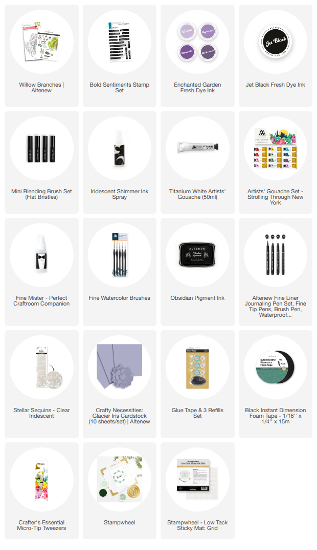
I cut a 4.25" x 5.5" panel of Crafty Necessities: Glacier Iris Cardstock. I then placed the Willow Branches Layering Stencils on top, one by one, to add ink blending using a Mini Blending Brush.
I used the following inks for the layers:
- Stencil 1 - Wisteria Fresh Dye Ink.
- Stencil 2 - Hydrangea Fresh Dye Ink.
- Stencil 3 - Ultraviolet Fresh Dye Ink.
- Stencil 4 - Andromeda Fresh Dye Ink.
- Stencil 5 - 2 layers of Andromeda Fresh Dye Ink, followed by a light layer of Jet Black Fresh Dye Ink on top.
- Stencil 6 (branches) - Jet Black Fresh Dye Ink.

When using the stencil 6 for the branches, I off-set it slightly so that there would be a slight highlight at the top of the branch. The branches have two layers for depth, but since I was using black ink, I just used the one. Off-setting slightly adds the highlight to the top and that creates the depth instead. This would also be a great idea if you wanted to add snow on the top of the branches!
Technically, using the black ink makes it not completely tone-on-tone, but I did not have a darker purple ink and I think the black blends in nicely with the purples!

Creating Interest
I wanted to add a little interest to the card but still keep to the tone-on-tone look, so I thought I would add a little splatter to the card.
This is always difficult for a clean and simple designer like myself. There is a fine line between adding too little, and adding too much! So instead of just adding a lot of one type of splatter, I added a small amount of three:
- Iridescent Shimmer Ink Spray (this gives a lovey shimmer to the card when tilted in the light - an almost magical feel against the tree branches).
- Titanium White Artists' Gouache mixed with a little water (this adds a little highlight to the card).
- Ultraviolet Artists' Gouache mixed with a little water (this sticks with the tone-on-tone look and adds some darker areas).
One the panel was dry, it was adhered to a white A2 (4.25" x 5.5") card base using Glue Tape.

Sentiment + Finishing Touches
I stamped a sentiment from the Bold Sentiments Stamp Set onto white cardstock using Obsidian Pigment Ink. It was cut into a strip and the sides 'painted' using a black brush pen. This removes the white core of the cardstock and neatens it up. It was adhered to the card using Black Instant Dimension Foam Tape.
To finish, I embellished with Clear Iridescent Stellar Sequins. I could have used purple embellishments here to fit in with the tone-on-tone look, however, since these are clear and have some iridescence to them, they pick up the purple tones on the card nicely!
I hope I have inspired you to try tone-on-tone layered stenciling. It is a perfect way to add depth to a clean and simple design. Thanks so much for stopping by today, I hope you have a wonderful day!

4th of July Special Surprise FREEBIE:
Get a surprise special FREEBIE on orders over $39 from July 4, 2026 at 12:01 AM EDT until 11:59 PM EDT. Shop here: https://altenew.com/collections/all-the-paper-crafting-supplies-you-need (Until supplies last)
SUPPLY LIST