Light & Airy Where Nature Meets Home Layering Stencils and Ink Blended Details
by Lea Lawson July 31, 2026

Key Takeaways
- Layered stencils — Using multiple blending brush sizes helps you create smooth gradients, crisp edges, and soft transitions throughout your scene.
Light‑and‑airy blending — Focusing on lighter tones in each color family while reserving darker shades for shadows keeps the entire panel soft and serene.
Ink‑blended die cuts — Starting with white cardstock and blending your own colors ensures your Jack Pine Tree perfectly matches the rest of the design.
Meaningful sentiments — Stamping the secondary sentiment directly onto the panel and heat‑embossing the main sentiment in Antique Gold adds warmth, shine, and emotional depth.
Cohesive scene building — Combining layered stencils, custom‑colored die cuts, and thoughtful sentiment placement creates a unified winter landscape full of comfort and intention.
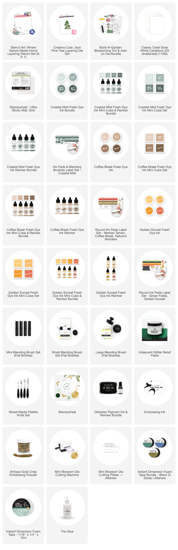
Hello, crafty friends! Lea here today, sharing a soft and serene winter card that feels like a deep breath of fresh, frosty air. This project features the Stencil Art: Where Nature Meets Home Layering Stencil Set (6 in 1), the Creative Cuts: Jack Pine Tree Layering Die Set, and the Build-A-Garden: Blossoming Trio & Add-on Die Bundle for the sentiments. Together, they create a peaceful winter scene filled with gentle gradients, delicate details, and a comforting message for anyone who needs a little extra warmth.
Working with stencils is one of my favorite ways to build layered scenes, especially when I want that signature light‑and‑airy feel. Today’s card leans into soft tones, subtle shading, and thoughtful ink blending through stencils to bring this snowy landscape to life. Whether you’re crafting for a loved one or simply enjoying a quiet creative moment, this project is a beautiful way to explore color, texture, and heartfelt sentiment.

Creating the Soft Winter Scene with Layered Stencils
The Stencil Art: Where Nature Meets Home Layering Stencil Set (6 in 1) is the star of this background, giving you a beautifully structured winter landscape while still allowing plenty of room for personal style. One of the best parts of working with layered stencils is how much control you have over the intensity of your ink blending. For this card, I focused on using lighter tones in each color family to build the base of the scene, then added darker tones only where I wanted extra depth or shadow. This approach keeps everything soft and airy while still giving the image dimension.
To achieve those gentle transitions, I used multiple blending brush sizes throughout the process. Larger brushes are perfect for sweeping color across the sky and snowbanks, while smaller detail brushes help you tuck deeper color into corners, tree lines, and architectural details. Switching brush sizes as you move through the stencils allows you to create smooth gradients, crisp edges, and subtle highlights without overwhelming the scene. It’s a simple technique that makes a big difference in the final look.
As you blend through the stencils, think about where natural light would fall across the landscape. Keeping the sky and snow areas lighter helps maintain that airy feel, while adding slightly darker tones to the trees and house gives the scene structure. The beauty of layered stencils is that they guide you through each element, making it easy to build a cohesive image with just a few ink colors and thoughtful blending.

Adding a Dimensional Pine Tree with Ink‑Blended Die Cuts
Once the background was complete, I added a focal tree using the Creative Cuts: Jack Pine Tree Layering Die Set. One of my favorite ways to customize die‑cut elements is to start with white cardstock and blend color into the pieces using the same inks I used in the background. This ensures that every element on the card matches perfectly — no hunting for the “right” shade of green or worrying about clashing tones.
You don't have to have stencils to blend beautifully! Blending ink onto die‑cut pieces also gives you more control over highlights and shadows. You can keep the tips of the pine branches lighter, deepen the center for dimension, or add subtle shading to mimic snow‑kissed edges. The result is a tree that feels like it belongs naturally within the scene, enhancing the composition without overpowering it.
This technique is especially helpful when working with layered stencils, because it allows your die‑cut elements to echo the same color story. Everything feels intentional, cohesive, and beautifully balanced.

Crafting Sentiments That Bring Meaning to the Scene
Sentiments are such an important part of a card like this — they give voice to the quiet beauty of the winter landscape. For this design, I used the Build-A-Garden: Blossoming Trio & Add-on Die Bundle, which includes both a main sentiment and a secondary supporting phrase.
I stamped the secondary sentiment directly onto the layering stencils ink‑blended panel. This anchors the words into the scene itself, almost like they’re part of the snowy path or drifting quietly through the winter air. Stamping directly onto the blended background also keeps the design soft and seamless, allowing the landscape to remain the focus.
For the main sentiment, I wanted something with a little more presence and shine. I heat‑embossed it in Antique Gold Crisp Embossing Powder, which adds a beautiful glow without feeling heavy. Gold embossing is one of my favorite ways to bring warmth into a cool‑toned card — it catches the light, adds elegance, and gently draws the eye without disrupting the airy feel of the design.
Once embossed, I die‑cut the sentiment and layered it over the layering stencils scene, placing it where it complements the tree and landscape without covering too much of the layering stencils detail. The combination of stamped and embossed sentiments creates a lovely balance of subtlety and shine.

Bringing It All Together
When all the elements come together — the softly blended stencils, the ink‑colored pine tree, and the warm gold sentiment — the card feels peaceful, comforting, and full of quiet beauty. This project is a wonderful example of how layered stencils can help you build detailed scenes with ease, while thoughtful ink blending adds personality and depth.
Using lighter tones as your base, switching between blending brush sizes, and adding darker shades only where needed within the layering stencils helps maintain that signature light‑and‑airy look. Pairing those techniques with ink‑blended die cuts ensures your focal elements match perfectly and finishing with a mix of stamped and embossed sentiments brings meaning and warmth to the final design.
Whether you’re creating a sympathy card, a winter greeting, or simply exploring new ways to use your stencils, this project offers plenty of inspiration for blending, layering, and crafting with intention. I hope it encourages you to slow down, enjoy the process, and let your creativity shine — unapologetically and beautifully.

Creating a soft winter scene with layered stencils, thoughtful ink blending, and custom die‑cut elements is such a rewarding way to bring peaceful, comforting cards to life.
I hope this project inspires you to explore new ways to use your stencils, experiment with color families, and create scenes that feel gentle, uplifting, and full of quiet beauty. Whether you’re crafting for someone who needs comfort or simply enjoying the creative process, these techniques offer endless possibilities for soft, expressive designs. If you give this project a try, I’d love to see what you create — may your crafting time be peaceful, joyful, and unapologetically sparkly.
Check Out The Cozy Cottage Stencils Tutorial Here!

I hope this inspires you to break out your favorite stencils and blend your heart out. Wishing you a wonderful day… happy crafting!
Warmly,
Lea
Cozy Cottage Layering Stencils Card Supplies