The Power of Primary Colors in Card Making + Video Tutorial
by Mindy Eggen March 26, 2025


Hello there crafty friends! This is Mindy and I am back today with my Inking It Up with Mindy series and today we are getting all kinds of inky!

Welcome to Creativity Unlocked, where we highlight a new product from each month's collection or a fan favorite from past collections!
Today's project is all about the power of Primary Colors in card making. We are not going for realistic – we are going for eye-catching and that WOW factor! So, let's get started!

Now I'll start off with I do not have any type of art degree or specialized training in colors. A lot of what I do comes from what “feels” right to me on a card and sometimes I'll blend an image multiple times until I find that feeling. This is why my default is rainbow because the colors all look good together. It's also why I have a hard time teaching what I do. It's hard to teach a “feeling” and I like to say do what feels right to you.
But let's start small. Let's start with primary colors. Primary colors are the foundation for creating all other colors and they also have the most contrast between each other. Contrast is what makes me stop in my tracks and go “WOW!”.

I believe their is a balance when it comes to using these colors and finding that balance can take a couple tries. It's all in the creative journey that we discover what works, what doesn't and what we didn't expect. This image could take on a whole different vibe if I used blue for the flowers and red for the leaves.
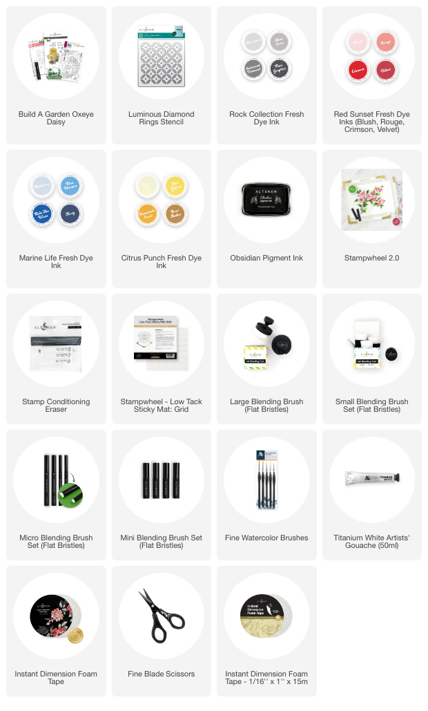
In my project today, I'm using the Build-A-Garden Oxeye Daisy. I felt it had the best size to work with in this experiment, enough layers to work with shading but not too many that I feel overwhelmed.

In the video tutorial I'm providing, I walk through the different shades I used to create all of this depth and contrast but the main ink collections used are:
I am also a strong advocate of different sized blending brushes. They all have a purpose and so thankful that Altenew provides us with these tools to enhance our designs and blending.
The blending tools I'm using are:

Take a close look at the background. See the subtle interest? That is the Luminous Diamonds stencil on a lightly blended background. That little dusting of blue helps the flowers pop off the card because of the white outline the die provided when I die cut it out.
Of course, my card wouldn't be complete without a little splatter but that is totally optional. The Titanium White works amazing for this.
The process is best seen in my video tutorial that you can check out on the Altenew Youtube channel.

Hope you enjoyed today's inspiration and will give it a try! I think you'll surprise yourself!
-Mindy