The Power of Monochromatic Card Designs | Take 2 With Therese + Video Tutorial
by Therese Calvird January 15, 2025

Hi there, it's Therese, and I'm back with another edition of Take 2 with Therese! Today, I'm sharing 2 different techniques to make a monochromatic card design!

Make it Monochromatic!
DEFINITION: Monochromatic means a color scheme that is based on a single color, or hue. The other colors within the color scheme are all light and dark variations of that hue.
Monochromatic schemes usually consist of three to seven color variations in your one-color palette, with darker shades, lighter tints, and duller tones of the original color. By using just one hue, you can create a balanced design. But, how can we use this in card designs?
I was inspired by these cards that I made right HERE. These were both ‘Ink Blended' ideas for a monochromatic design, but it doesn't have to stop there.
TECHNIQUE IDEAS
-
Layered Stamping is perfect, grab multiple inks (or set of inks) of the same hue and stamp the layers of a flower, but instead of stamping a different color for the leaves use the same hue, make it lighter or darker. Or, why not use a ‘neutral' tone instead. These are your get out of jail free cards… bring in white, black, gray, creams, or how about some shiny silver or gold?
- Coloring: Use any medium you love to create a monochromatic design, or why not mix them up. My personal favorite is watercolor mixed with pencils. And, for a more ‘pure approach', you could even stamp the image in the same hue that you will be coloring, either darker to make it easier, or lighter for a no-line look.
-
Ink Blending: As seen by my initial inspiration, blend a background, either in one color or use multiple to create an ombre look. Add some splatters for a more dramatic effect. For me, I often grab out the Antique Gold Ink Spray, it's a fave. Tone on Tone – To take it a step further, stamp a background or an image in a darker color of ink to create a tone on tone effect.
Blend Images – Use coordinating stencils (simple or layering) to ink blend the images using one or multiple colors of the same hue. - Cardstock: Why not start with colored cardstock? Choose cardstocks of the same hues that look ‘good' together, or use a color wheel to help you. Did you know that there are free color wheels available online? Layered die cut images are perfect for this idea, you can use the same color and add shading with a little ink blending for depth or keep it simple without the shading but shake it up a little by layering up different colors for the petals in one flower. Or layer up colored cardstocks of the same hue to create a quick monochromatic background.
-
Silhouette Stamping: There are a few ways to use this idea. One way would be to blend a background first and stamp the silhouette in a neutral color (get out of jail free, remember?), or actually stamp the silhouette image/s in your hue of choice. You can also shake it up by adding an ombre combo of colors, but this is much easier to do if you use a stamp positioning tool.
OR, choose a large bouquet image and ombre stamp this and leave it as line art… or use a large background stamp for a modern one color look! - Give it a Go! The possibilities are endless and you don't have to reinvent the wheel. Why not grab your favorite card design and challenge yourself to remake this as a monochromatic card, it's amazing how different it will look. And, if you have trouble choosing a color, then I recommend using a combination of greys instead, this will basically look like a pencil sketch with amazing shading!
Idea #1: Layered Die Cuts With a Monochromatic Design
You may already know that I like a lit of use of ‘white space' and by using this in a monochromatic design, it can make it feel less daunting. But, you can add as little or as much as you want. As long as you keep similar hues together, and to stretch that a little further, you can add as many as you want.

I used a total of 3 different colored cardstocks, but added some easy shading with some coordinating ink and a detailed blending brush.
PRO TIP: A fun way to step up a design is to add some glitter cardstock, and I also thought that this was a great way to add the leaves.

You may also notice that I brought in some metallic cardstock, I felt that this color worked perfectly, but a simple basic gold would have looked amazing too!

Idea #2: Silhouette x Monochromatic Effect
This design should have been very quick and easy, so, I don't know why it took me so long . I messed about with it for ages, I even stamped multiple panels and tried adding texture with a Press Plate. It looked good, but to me, it didn't co-ordinate with my first card enough (weird right?).
So I started again and, I kept it simple. I stamped an ombre floral silhouette image using only 2 shades of ink.

I added some fun elements to the design by recessing the shadow portion of the sentiment and building up the sentiment to sit nearly flush to the top of the card front.

And used the same metallic and glitter cardstocks to add a beautiful butterfly.
BONUS IDEA: This would make a great quick and easy ‘gift set' of cards created in multiple colors using a variety of sentiments. Though, you may want to hold back on the dimension (I just can't help myself).

How to Use a Monochromatic Color Scheme 2 Ways!
Watch the video tutorial below to see how I made these cards. Click here to watch it in HD on YouTube.

I hope you are inspired to use a monochromatic color palette on your next handmade card project!
Have fun crafting!
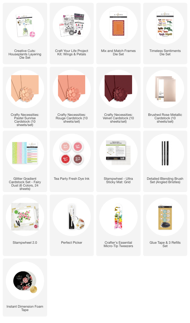
Supply List ~