Layers of Lenten Grace Blooms | Tremendous Textures with Erica
Hi Altenew fans and friends, it's Erica back on the blog and YouTube channel with two cards today. I have been on a bit of a roll recently and made loads and loads of cards in my recent posts, so today I thought I'd slow right down and take my time with some lovely layers, pops of colors and some... ok. ok. lots of bling!

Watch the video tutorial HERE
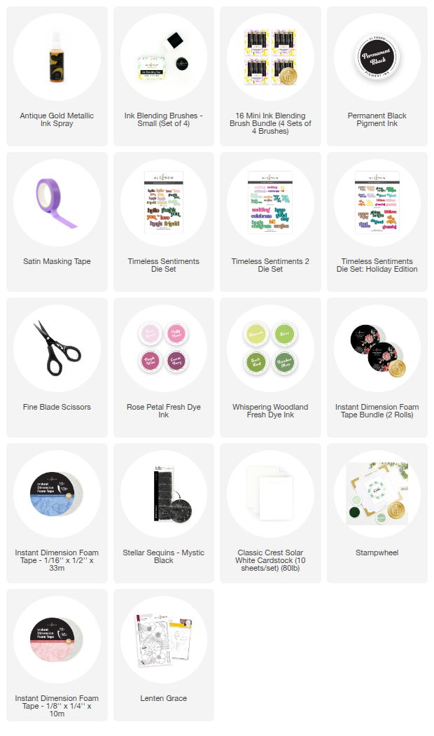
Lenten Grace Set
The Lenten Grace set has a stamp set and layering stencils, there is no coordinating diecut (which I will sulk about privately) but the images are big and bold, which makes them relatively easy to fussy cut. I'm not normally a fan of fussy cutting but I will do it for big blooms that will look fabulous layered up.
Lovely Layers
My first idea was to make just one card and stamp up the biggest Lenten Grace image, add color using the coordinating layering stencils, fussy cut one out and then layer them up with some Instant Dimension Foam Tape. Sounds pretty straight forward, doesn't it? It was going so well too, until I got to the assembly part. Then another idea popped in, and all of a sudden, I went from one very, very layered card, to two with just two layers each.

Right, let go back a little bit: First off, I stamped up a couple of panels with the Lenten Grace image, I used Permanent Black ink and the Stampwheel to get crisp images. Next, I grabbed some pink and green inks and got ink blending. I have listed the inks down below if you wanted to know the exact colors I used.
I try to add the illusion of depth and layers with ink blending too, it brings so much life to a 2D image, and I think it looks fabulous myself. The easiest way to do this is to use a light color first and then build up the intensity with the darker shades until you are happy with the contrast and depth. I demonstrate this a little in the YouTube video if you aren't sure what I mean, or if you are a more visual person (like me)
Once all the ink blending was done, I grabbed my little handy Fine Blade Scissors and fussy cut the smaller of the panels out. I tried keeping as close to the image outline as possible, as I didn't want any white between the floral layers.

A Plan Foiled
As I mentioned, my first plan was to layer these up onto each other and then add them to a card base, but as I was puzzling these together and contemplating adding some gold splatters to one of the layers, I decided to put each one of the floral layers on a separate card base. I know, I know, I really did try to make just ONE card today but when inspiration strikes, I have to go with the creative mojo.
I spritzed some Antique Gold Metallic Ink Spray on the bigger floral image, and then I took a plain card base and added some to that too. Now, this stuff is addictive! It's so easy to use, it gives amazing shimmer and looks gorgeous on everything.
I think the results speak for themselves, am I right or what? If you don't want as much shimmer as I have gone for here, you can open the bottle and use a small paint brush to create smaller droplets with more control.

Matching Shimmer
One of my most used, and most loved, sentiment sets is the Timeless Sentiment range. They are so lovely and so versatile, I absolutely love them and recommend them to anyone who likes die cut words and sentiments. They look fabulous on their own, or layered with the shadow die cut part, and stacked high for maximum impact! I have been slightly addicted to cutting them out of Glitter Cardstock, but again... can anyone blame me? For these cards I have used Glitter Cardstock in Citrine, but Smoky Quartz is a fabulous choice too.

This is the Timeless Sentiments Die Set and I can say with certainty that this is a must have. I know I'm harping on about it a bit, and it's quite possible I have over-used it a smidge, BUT I like to think of it as showing how classic and timeless (zero pun intended, that wrote itself!) this set is.
From the Lenten Grace stamp set I picked out a few of the smaller sentiments to go along with the 'thank you's'. These are stamped up with Permanent Black ink on white card stock, and these have been trimmed down to slim banners.

Assembly!
With all the bits and pieces all prepped, fussy cut, trimmed down, layered with Instant Dimension Foam Tape, and stamped, it was time for assembly! This stage is where I usually slow down a little bit. I do like to take my time puzzling a little, trying a few layouts and layers, and comparing how sentiments look etc. This is also my favourite stage! Even when you have an idea in your head of how things will look like in the end, this is where the magic happens as you put the idea to the test. If I had been 100% determined to stick to my first idea, with the three layers, I would have had one card instead of two.

Even though these cards did not end up like the deliciously layered gorgeousness I had pictured it as when I first started, especially given that it was supposed to be ONE card and not two, I must admit that I think it actually worked out better this way. These will be easier to mail, with less layers as well, I suppose.

Given that they are both quite shimmery and sparkly thanks to that gold spray, you could leave them as they are embellishments wise. Good for you if you are one of those persons who can actually stop before adding ALL THE BLING, but if you are like me, HI!!

For these I thought it would be a nice little pop to go for the Mystic Black Stellar Sequins, rather than a gold. As much as I like gold on my cards, I do like a nice little contrast too. It helps add another layer of interest, doesn't it?

I really hope you have enjoyed this post, the layered cards and the Youtube video as well. I'd love to hear what you think of the cards, my original idea and if you have any suggestions on how to stop the run-away-idea-train that is my creativity. Until next time, with love and light,
Your girl, Erica.