Ink Blending and Embellishments Make Everything Better! | Tremendous Textures with Erica (with Video Tutorial)
Hi, ink blending fans! It's Erica back on the Altenew blog and YouTube channel with a card featuring yummy ink blending and some subtle texture thanks to some gorgeous embellishments.
I'm a big fan of ink blending and bling, so it just makes sense to combine to the two, right? Technique wise, it's really hard to beat ink blending. It's fast, versatile, great for beginners and advanced crafters alike, and it is most importantly SO FUN!
Ink Blending + Embellishments = Instantly Beautiful Card (Video Tutorial)
Here's a video tutorial if you prefer watching the ink blending process! Click the image below to watch it or watch it on YouTube here.

How to Create Subtle Texture with Ink Blending and Embellishments
Today's card features the fourth stencil in the beautiful Sulphur Cosmos Layering Stencil set. The first three create the floral image, like you can see in the photo below. With this set, you actually only need the layering stencils, in a pinch. I did stamp the outline image from the stamp set in Limestone ink, but it is so faint it doesn't make much of an impact. I wanted a soft no-line coloring look for that card so it worked out perfect ink blending the layers on top of this!

I have used the grippy mat in the Stampwheel to keep my cardstock in place, both for the stamping of the outline image and while I do the ink blending through the stencil. This is such a game changer when it comes to making ink blending a breeze, as it holds the stencil in place without washi tape that can rip your master piece when you take it off.

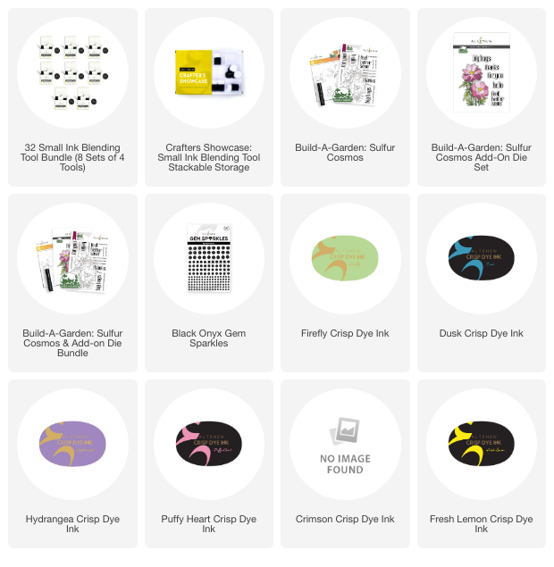
If you want to do ink blending yourself in the exact order I have done I have used the following colors, from right hand bottom corner to top left corner: Citrus Burst, Amber Blaze, Crimson, Puffy Heart, Hydrangea, Dusk, and Firefly.
I'm a little bit extra with ink blending, I can't help it, so I like having an ink blending tool for each color… which I am fully aware is extravagant, but it's one of those little things I like. You do not by any means need to be anywhere as extra as I am, having one or two for each colour family is perfectly fine.

The sentiments I added to the card are from the Sulfur Cosmos stamp set, and these are stamped up with Permanent Black Ink using the StampWheel to make sure they are really crisp and solid. To cut them out I carefully fussy cut… no, I didn't, I'm not a fussy cutter. My up close eyesight is starting to go a bit blurry, and I don't have the level of patience needed to get nice clean lines so I used the coordinating diecuts.
These are added to the card with a bit of Instant Dimension Foam Tape, to pop them up a little bit from the background.
I have also used a lot of the smallest Onyx Gem Sparkle mix to add a touch of dramatic texture on top of the ink blending. In the middle of each medallion I added one, and also on the dot over the ‘I' in ‘big'. That pop of black really makes the design stand out and I do think it would look awesome with the iridescent ones from the Smoky Quartz Sparkly Gem mix too, actually. If you want a slightly softer look, that is.

With this whole thing added to a card base, the card was done. Oh I might have forgotten to mention I trimmed down the background panel a little, so that it will have a white frame around it. It's a little thing to do, but it makes a big difference and I'm very partial to doing this with my cards.
I hope you have enjoyed this post and will get a chance to watch the video tutorial too. Click here to watch it.
With love and creativity,
Erica
~Supply List~