How to Use Color to Create 2 Different Looks on Handmade Cards | Take 2 with Therese (with Video Tutorial!)
by Therese Calvird October 19, 2022

Hi, it's Therese, and I am back with another edition of Take 2 with Therese. Today, I'm sharing how to use color to create a new look for your handmade card!
I made 2 fabulous floral cards using the beautiful Craft Your Life Project Kit: Feathered Lilies!
 Color is such an amazing thing, and today I wanted to share just how different the same image can look by just adding color… or not adding color!
Use Color to Create 2 Different Looks on Cards
Idea # 1 – Black & White
Starting with a soft, muted black & white version.
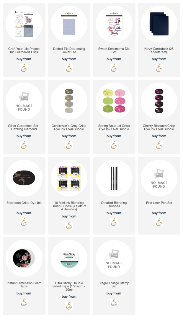
 I used the Gentleman's Gray Crisp Dye Inks and blended the layered stencils before adding some dimension with the perfectly coordinating 3D Embossing Folder.
The Craft Your Life Project Kits have everything you need to create with various techniques and stretch your supplies!
 I thought this card would be perfect for a sympathy design, so I chose a sentiment from the Fragile Foliage Stamp Set.

Idea # 2 – Bold & Bright
For my second card, which has a brighter design, I blended the Cherry Blossom and Spring Bouquet Crisp Dye Inks.
 To add some subtle background texture, I debossed with the Dotted Tile Debossing Cover Die on some Navy Cardstock.
BONUS TIP: To change up the look of your design, a large bouquet such as this can be tipped and turned on different angles on the card front!
 This time it was easier to add a die-cut sentiment, so I used the Sweet Sentiments Die Set and some Dazzling Diamonds Cardstock.
 You can see my video here or watch it in HD on YouTube.
SUPPLIES USED: