Take Your Background Panels to the Next Level! | Take 2 With Therese + Video Tutorial
by Therese Calvird November 20, 2024

Hi, it's Therese, and I'm back with another edition of Take 2 with Therese! Today, I'm sharing a simple embossing folder technique that will take your background panels to the next level!

Embossing Highlight Technique for Background Panels!
If you love creating background panels, but never know how to use them on your card designs, then today's simple and fun technique is for you. Combining beautiful backgrounds with a 3D embossing folder and a swipe of ink, can really add wow factor to your card design.
TECHNIQUE TIP
If you have inked backgrounds ready to go, then you are halfway there, so, start by grabbing one of your favorites! Choose a 3D Embossing Folder, it can be anything, a floral design looks amazing, but then… so does a graphic pattern. I decided to share an example of each today.
I decided to create a washy watercolor look background using/smooshing Ink Sprays. But you could also use ink pads (smooshing), watercolor paints or even acrylics!
You can either cut the panel down to size before or after embossing. Just remember that if you cut it after to use a paper trimmer, as using a rectangle die may ‘flatten' the embossed image when running it through the die cutting machine.
Next, swipe a white pigment ink over top of the raised sections of embossing. Other options here are to ‘sand' the image back a little first to help grab the ink, or use a finger dauber or detail blending brush to add the details. Allow the image to dry and add it to the front of your card and decorate as desired! I found that white or gold splatters, as well as pearls and rhinestones, suit these backgrounds beautifully!
Idea #1: Floral Image
My first example uses a gorgeous 3D floral embossing folder. The image looks quite subtle but the softness of the white pigment ink works like magic to bring out the details.

PRO TIP: Pigment ink pads require reinking more often than dye ink pads, typically I will buy the Pigment Re-Inker when I buy the pad so that I can keep it ‘nice and juicy' which is what is needed for techniques such as this.

I added some white ink splatters, but if you don't have a spray you can create the same look using a white water based paint or gouache and add a little water and splatter it with a brush instead. You may also notice some sweet little Gem Sparkles too.

Idea #2: Graphic Pattern
I wanted to stretch this technique a little and, this time I used a 3D graphic style pattern. The busy pattern covers more of the original background once it is swiped but it is still easy to see the variations of color in the ‘debossed' sections.

To me, this felt like a more masculine ‘look' and I always need some of these for my stash so I kept it simple and brought in the fish. AND, this fab sentiment, it's actually a ‘Press Plate' and creates multiple sentiments in one swipe!

Does this card look familiar to you? It's a very similar design to THIS CARD (and video) that I shared using a different kind of fish.
BONUS TIP: Remember, that you do not always have to reinvent the wheel. You are allowed to have ‘go-to' layouts and designs, because, you can always change it up with the elements and sentiments that are added.

Take Your Backgrounds to the Next Level Video Tutorial
Watch the video tutorial below to see how I made these cards. Click here to watch it in HD on YouTube.

I hope you are inspired to create using the Embossing Highlight Technique on your next handmade card project!
Have fun crafting!
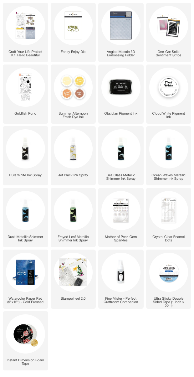
~ Supply List ~