VIDEO Tutorial: EASY Tips for Adding Tremendous Texture | Two Products, Two Different Looks.
Hi Altenew friends and fans! It's Erica back on the Altenew blog (obviously, lol) and the YouTube channel with a new video and lots of tips on how to add that coveted texture and dimension.

How to Add Texture to Your Cards
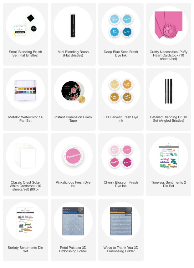
I will be using some of the gorgeous newly released items from the November release, specifically the Petal Palooza and Ways To Thank You 3D Embossing Folders. I have also used the Scripty Sentiments Die Set, mixed with an older one called Timeless Sentiments 2 Die Set.
A spot of die cutting is never wrong, if you ask me, especially when you have gorgeous colored cardstock to use. I will have another video later in the month doing more die cutting with an array of colored cardstock. One might say I am on a ROLL in the video, lol!
In the video, I am showing a few ways to add color and texture to your backgrounds, and how to highlight some of the patterns from the 3D embossing folders. I had planned on doing the video in real time, but by the time I was finished filming all the footage it was almost an hour.
I figured nobody would sit through a video quite that long so I trimmed it significantly, but please do let me know if you want to see more of something specific in the comments. Your wish is my command, I obviously want to make videos that are helpful so hit me with it!
So first things first, we are going to build a 3D embossing folder sandwich, and it is different depending on what kind of die cutting machine you have so make sure to check the instructions before making a guess and potentially damaging your machine.
As I have a Spellbinders Platinum 6 machine, the instructions actually come on the platforms themselves, which is so handy. For instructional purposes I go through how I build the embossing sandwich in the video, as the Platinum is a relatively popular die cutting machine.
I was on a bit of a roll and made two each of both 3D embossing folders, and I might have gone slightly overboard showing this in the video too, but better too many times than not enough! Honestly, if you want to hit the 2x speed button, do it and then pause at the bits you want to really see. I won't take it personally, I did prattle on for quite a while after all.

On both panels made with the Petal Palooza Embossing Folder I have used pink inks to highlight the pattern. It's mostly Pinkalicious, with a spot of Rubellite, but in all honesty, I wish I had not added the darker pink and just kept building up the Pinkalicious. You live and learn, right?

The finished panels have all been trimmed down a little bit, to create a ‘frame' when it was adhered to the card base. I like this way of adding dimension to a card, you get a nice little detail added by trimming off parts of the panel. Which sounds nuts, but it's true. Another neat little trick to adding dimension to cards is by using foam tape, for which I have another little tip for you. I show this in the video too, and how to avoid getting sticky scissors.
These two pinkalicious cards have got the same sentiments added to them, only in reverse. The ‘have a good day' sentiments is from the Timeless Sentiments 2 Die Set, and I have cut it out of Puffy Heart and white card stock. The Crafty Necessities Puffy Heart Cardstock was the closest pink I had to match the Pinkalicious Dye Ink, and I like having the two opposites to give each card a slightly different look.

The ‘friend' part is from the Scripty Sentiments Die Set, and I have done the same thing with these. I cut them out of Puffy Heart and white cardstock, and layered them up. This is also shown in the video, if you want to see how easy they are to line up.
Another thing I thought important enough to show in the video was two different ways to raise up the sentiments. One has had two more die cut pieces layered up behind it, and the second one has Instant Dimension Foam Tape. It's a small thing to change, and you might think it doesn't make much of a difference, but it actually does. It's subtle, but it's definitely different.

Both of the pink cards were finished off with some gorgeous enamel dots from the Bubblegum Dreams Enamel Dots set, I used darker ones on the one with more opaque ink blending. I went with the darkest color here as a nice contrast.

It was a tough choice but I went with the lighter ones on the paler pink card. I stuck with the smallest sized enamel dots for both cards. Just different colors.

What do you think? Which one do you prefer? I surprised myself by liking the paler pink better than the darker one. What is happening here? Why do I all of a sudden seem to be so much better at embracing white space and actually liking it?

Onwards to the next two cards! The Ways To Thank You panels. For these I wanted to do more ink blending, but with different colors and also slightly different techniques. The first one is straight up ink blending using Butternut and Pumpkin Pie Fresh Dye Inks, from the Fall Harvest color family.
I wanted an ombrè look, and if you have seen the video, you will know that it took me a while to get there. I did think that I would use at least three ink colors for this but only ended up needing the two.

The second panel I used only Tide Blue Fresh Dye ink on, which is an absolutely gorgeous blue color. First I ink blended it onto the panel, and then I used the ink pad directly on top of it. Not with a lot of pressure, but a light, almost floating hand, I swept it across the raised pattern to let it catch the color. If none of this makes sense, don't worry, I have zoomed in while filming this part of the video to really show how I did it. It's easy, but gives a beautiful effect.

With the ink blending done on both of these, I decided to add some gold splatters using the Metallic Watercolors 14 Pan set. While that was drying, I cut out more word dies from the Scripty Sentiments set, in Crafty Necessities Ultramarine Cardstock, white and also Brushed Gold Metallic Cardstock. I used the ‘hello' and ‘friend', which might seem a bit of a strange choice for a panel that is all about ‘thank you's' but bear with me.

I put these panels onto white card bases too, using the same trick of trimming down the panels a bit for that frame, and using rather a lot of Instant Dimension foam tape. The word die cuts I have then placed on top of the panels so that they kind of frame one of the sentences from the 3D embossing folder.
With these two I surprised myself again by liking the yellow one better, despite being a blue loving gal. What do you think?
Right, I have jibber-jabbered on for quite a while so I will let you go now, thank you so much for stopping by to learn more about adding texture to your cards. I hope you get a chance to watch the video too, if you want to check it out you can find it HERE.