Vibrant Two-Tone Tulips with Layering Stencils
by Erum Tasneem November 15, 2026

Key Takeaways
Achieve a No-Line Effect: Stamp floral outlines in pale yellow ink (like Buttercream) to guide stencil placement without leaving harsh dark borders.
Master Two-Tone Blending: Combine warm oranges (Snapdragon) and bright pinks (Fuchsia and Magenta) through layering stencils using varied hand pressure for seamless color transitions.
Prevent Stencil Shifting: Use a touch of Glue Tape behind delicate stencil openings to keep intricate ink blending crisp and clean.
Balance Bold Florals: Pair vibrant flowers with a soft diagonal ombré background, subtle diluted ink splatters, and intentional white space so the card design never feels overcrowded.

Have you ever seen parrot tulips in full bloom? With their beautifully ruffled petals and striking combinations of pink, orange, and yellow, they're truly a sight to behold!
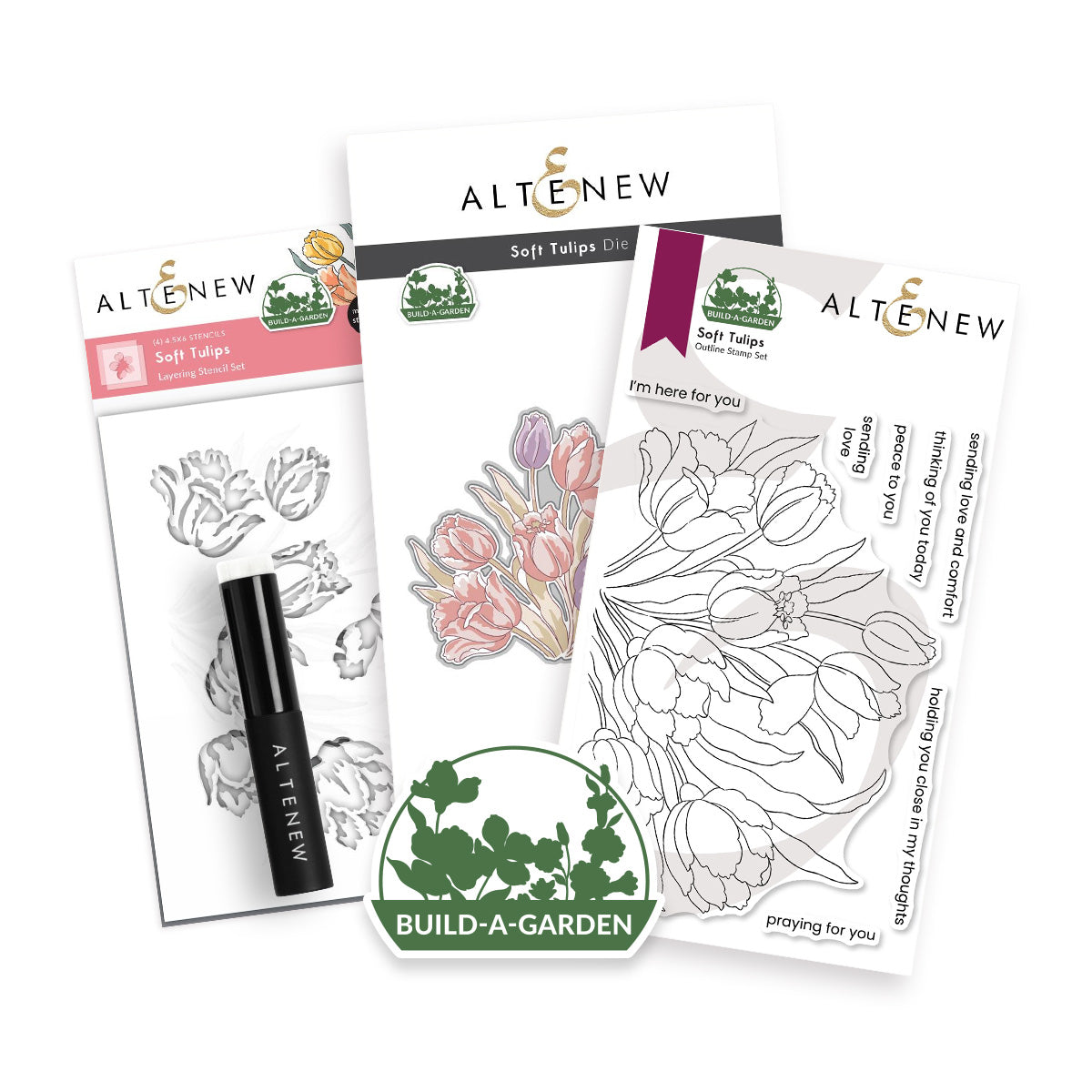
Inspired by these colorful flowers, I'm using the Build-A-Garden: Soft Tulips Stamp and Layering Stencil Set to create vibrant two-tone tulips with layering stencils that feature smooth color transitions and added depth.
However, this cardmaking project isn't just about ink blending! I'll also share how to balance bold floral elements with a soft background, subtle splatter details, and intentional white space. The ultimate goal is to create a handmade card that's full of color and dimension without overwhelming the eye.
VIDEO: Vibrant Two-Tone Tulips
Watch the video tutorial below or CLICK HERE to learn more about this cardmaking technique! Or read step-by-step instructions after the video.
Step-by-Step Guide: Ink Blending Two-Tone Tulips with Layering Stencils

Step 1: Stamp the Tulips for a No-Line Coloring Effect
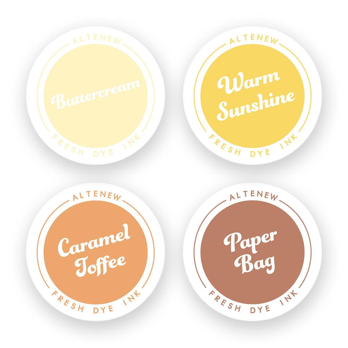
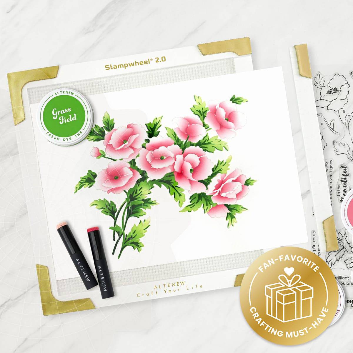
Stamp the tulip image twice onto Classic Crest Solar White Cardstock using Buttercream Fresh Dye Ink and the Stampwheel 2.0.
Buttercream is a pale yellow ink that provides just enough of a faint outline to guide your stencil placement without leaving a prominent, dark stamped border. This creates an almost no-line coloring effect, allowing the vibrant ink-blended colors to take center stage while maintaining a softer, more painterly appearance.
Tip: Any very light yellow ink will work for this technique, provided it doesn't interfere with the colors added through the stencils.
Step 2: Prepare and Secure the Layering Stencils
The coordinating stencil set includes four stencils: two for the tulip blooms and two for the foliage. Some of the stencil openings have delicate, narrow bridges that may lift or shift during ink blending.
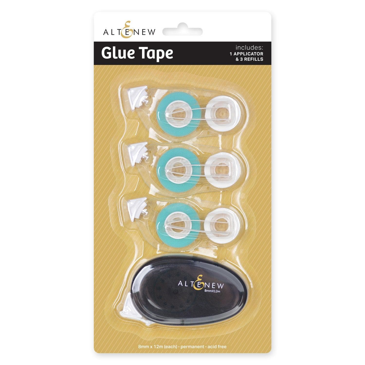
Apply a small amount of Glue Tape behind these delicate areas to temporarily tack them down against the cardstock. Position the first stencil over the stamped image, secure your cardstock to a sticky mat, and gently press down the narrow sections. This extra step prevents unwanted movement and keeps your ink-blended edges crisp.
Step 3: Blend Two-Tone Tulips with Snapdragon and Fuchsia
Position the first floral stencil over the stamped tulip image.
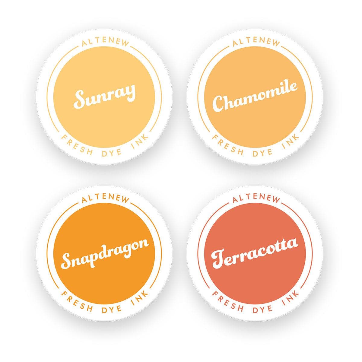
Begin ink blending Snapdragon Fresh Dye Ink from the tips of the tulips toward the middle, using medium hand pressure to create a vibrant orange. Leave the lower portions of the flowers uncolored for the pink.
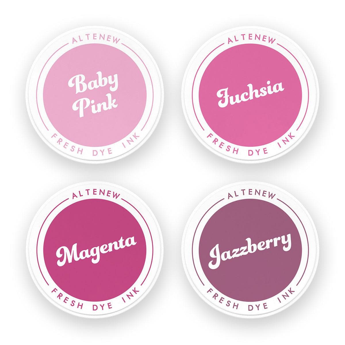
Wipe the stencil lightly with a dry cloth to remove excess orange ink, then blend Fuchsia Fresh Dye Ink upward from the base of the flowers using lighter hand pressure.
Allow the two colors to meet and blend naturally toward the center of the petals. Because Fuchsia is highly pigmented, applying it with a light hand helps maintain a smooth gradient without overpowering the warm orange.

Step 4: Add Floral Depth with the Second Layering Stencil
Position the second floral stencil over your base layer to add detailed shading to the petals.
Apply Fuchsia Fresh Dye Ink with heavier pressure near the base of the tulips, blending upward approximately halfway through the petals while leaving the tips relatively untouched.
Next, blend Snapdragon Fresh Dye Ink onto the petal tips, building a stronger orange that transitions seamlessly into the pink.
Clean the stencil as needed before lightly blending additional Fuchsia into selected orange areas. This layering creates richer color transitions and adds realistic dimension to the petals.
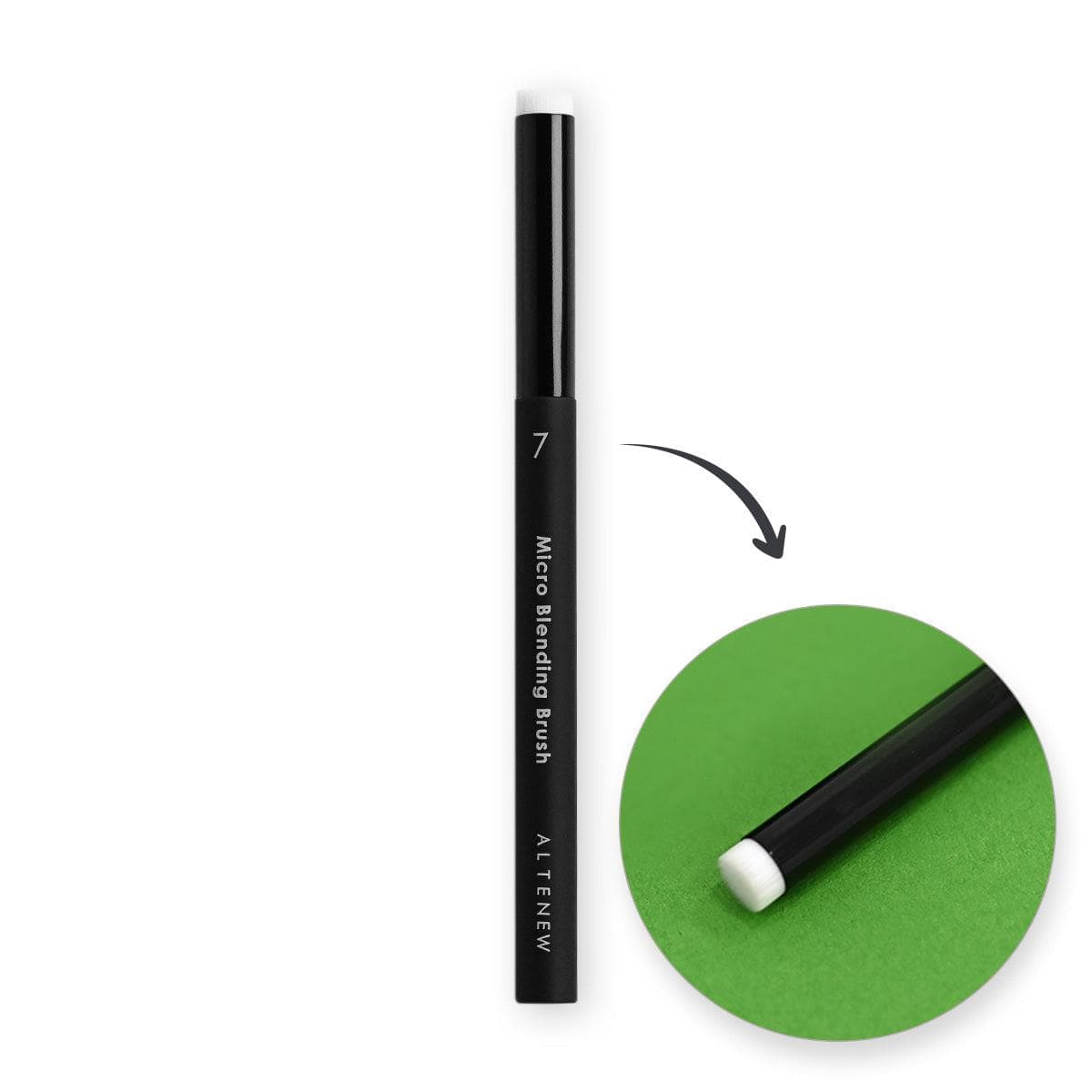
For extra depth, use a Size 7 Micro Blending Brush to apply a small amount of Magenta Fresh Dye Ink near the very base of the flowers. Keep this shading subtle to avoid darkening the entire tulip.
The combination of orange, pink, and magenta creates vibrant tulips reminiscent of the exotic hues found in real parrot tulips.
Tip: Adjust the amount of each color according to your preference. More orange will create a warmer flower, while additional Fuchsia will give the tulips a stronger pink appearance.

Step 5: Add Color Variations to the Foliage
Position the third stencil over the stamped foliage.
Begin by blending Buttercream Fresh Dye Ink onto selected leaf tips, adding a touch of Snapdragon Fresh Dye Ink where a warmer yellow-orange tint is desired.
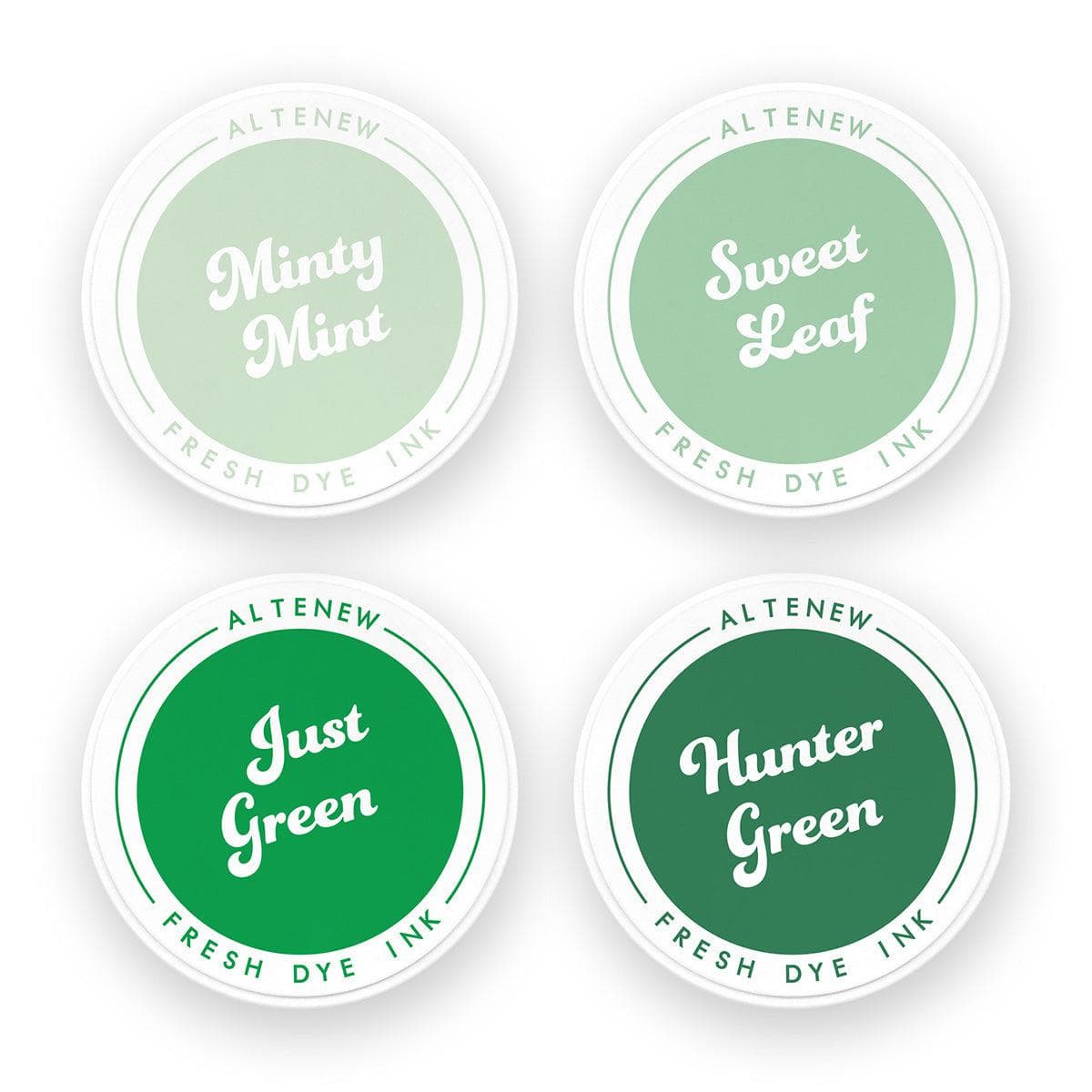
Next, blend Just Green Fresh Dye Ink through the stencil, allowing the green to transition smoothly into the yellow areas.
Vary the amount of yellow and green throughout the foliage rather than coloring every leaf identically. These subtle tonal variations add organic visual interest and prevent the leaves from appearing flat or uniform.

Step 6: Deepen the Foliage with Hunter Green and Die Cut
Position the fourth stencil and apply Hunter Green Fresh Dye Ink to add darker shadow details to the leaves. The deeper green creates crisp contrast against Just Green, defining the foliage and adding depth.
Repeat the entire ink-blending process on your second stamped tulip image.
Once both floral clusters are complete, align the coordinating die over each image, secure it with Satin Masking Tape to prevent shifting, and run them through your die-cutting machine.
Creating a Balanced Card Background and Layout
Step 7: Create a Soft, Diagonal Ink-Blended Background
- Mini Blending BrushOn a panel of Classic Crest Solar White Cardstock, begin blending Volcano Lake Fresh Dye Ink from the top-right corner toward the center.
- Repeat from the bottom-left corner, gradually fading the ink inward to create a soft diagonal ombré effect.
- Start with a large blending brush for a smooth, diffused application.
- To deepen the color around the edges, switch to a Mini Blending Brush, keeping the center lighter.
Because Volcano Lake is a relatively soft ink color, it's possible to build intensity with a smaller brush without creating harsh patches. However, if you tend to apply heavier pressure, gradually transition through smaller blending brushes for better control. The finished background should have a soft halo toward the center, providing breathing room for the vibrant floral arrangement.
Step 8: Add Subtle Texture
- Press a little Hunter Green Fresh Dye Ink onto a craft mat and dilute it with water.
- Add splatters across the ink-blended background to introduce texture and interest.
Design Tip: Balancing Vibrant Colors with Soft Details
Just because your focal elements are bold doesn't mean every other element needs to be equally bold.
Although the tulips feature vibrant pinks and oranges, the absence of a dark stamped outline gives them a softer appearance.
Adding splatters would introduce stronger contrast, potentially competing with the flowers and changing the overall feel of the design.
Instead, diluted Hunter Green adds texture without overwhelming the background.
Neither approach is right or wrong. The choice depends on the look you want to achieve.
For this project, the softer splatters help maintain balance while allowing the colorful tulips to remain the focal point.

Step 9: Arrange and Adhere the Tulips
- Adhere the completed background panel to a card base.
- Arrange the die-cut tulips around the edges, allowing portions of the flowers and foliage to extend beyond the card.
- Experiment with the placement until the tulips frame the design while leaving some of the background visible.
- Once satisfied, use a little Glue Tape to temporarily secure the floral images.
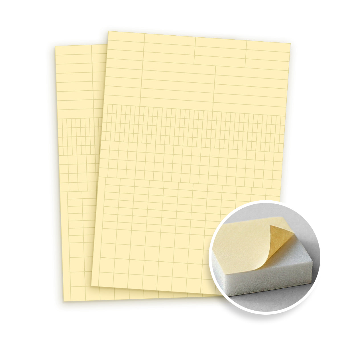
- Flip the panel over and trace along its edges onto the back of the die cuts with a pencil. These pencil lines serve two purposes: they indicate where the excess die cuts need trimming and guide the placement of Instant Dimension Foam Tape (Foam Squares).
- Apply the foam adhesive within the marked boundaries to provide support without extending beyond the card edges.
- Secure the floral images permanently and trim away the excess portions for a clean finish.
Step 10: Maintain Balance with Intentional White Space
After trimming the floral images, you may have leftover pieces that can be added to fill the open areas.
While these can create a fuller floral background, leaving some space uncovered allows the design to breathe.
The vibrant tulips already contain plenty of detail, color, and movement. Filling every available space could make the arrangement feel crowded.
By keeping some of the softly ink-blended background visible, the flowers remain the focal point while the splatters and subtle color transitions complement the composition.
Design Tip: White space doesn't necessarily have to be white. Any relatively quiet area that provides visual relief can help balance a detailed composition.
Step 11: Add the Sentiment
- Stamp the sentiment "sending love and comfort" onto a strip of white cardstock and trim it to size.
- Tuck the sentiment strip slightly beneath the surrounding flowers.
This placement is intentional. The direction of the flowers naturally guides the viewer's eye toward the sentiment, helping it become part of the overall composition rather than appearing as a separate element.
It's a simple design decision that adds cohesion and reinforces the balance of the finished card.

Final Thoughts on Stenciled Two-Tone Tulips
I love how these vibrant two-tone tulips turned out! The combination of Snapdragon, Fuchsia, and Magenta creates effortless color transitions, while the second layering stencil adds rich depth and dimension to every petal. Despite the bold palette, the no-line stamping effect, soft diagonal background, and diluted green splatters give the finished card a surprisingly gentle, cohesive look.
I hope this tutorial inspires you to experiment with blending multiple ink colors through your layering stencils. Remember, using vibrant colors doesn't mean every element on your card needs to compete for attention—sometimes, subtle contrast, softer details, and a little breathing room are all you need to create a beautifully balanced handmade card.
Thanks so much for stopping by! Happy crafting!
Supply List
|