Color inspiration from Packaging - Let's Find Out!
Hello, hello Altenew and color fans! It's your color loving gal Erica back on the blog and today let's talk color inspiration!
Where do you get most of your color combo inspiration from? Fashion? Art? Nature? Book covers? There are so many places you get inspiration from and none of them are 'wrong'. As long as it gets your creativity humming and your mojo crackling, that is all that matters!
Unexpected Color Inspiration Source
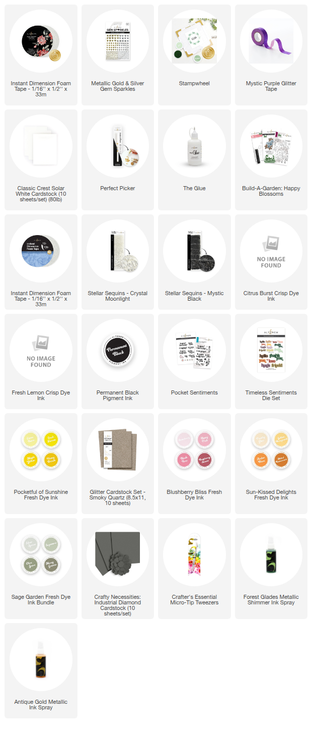
I'm going to be using the Build-A-Garden Happy Blossoms today, and the color inspiration for these four cards actually came from one of the boxes I got my Altenew goodies in! I love that the boxes change up regularly and it almost feels like you are getting a gorgeously colored little piece of art in the mail. There have been some absolutely stunning designs, but the one that just made me so happy to look at was the one my February release goodies came in! The colors are so fantastic and I just loved it! (I'm going to try my best to make sure I include a photo of it, but in case it's not here at the time of publishing, my menopause brain has gone 'nope, we don't remember saying that')
I'm also a big fan of the Build-A-Garden sets, the fact they come with a stamp set, a layering stencils set and also coordinating die cuts. *chef's kiss* I love them, I really do. I normally try to use colors as close to the packaging/inspiration as possible to see which colors I would use and interpret it, but with this one I am using the packing as color combo inspiration.
Inks and Colors!
First off, we are going to stamp up a bunch of the floral cluster stamp, so we have options and backgrounds. I like using the stamp with some lighter ink colors to create a softer look, as well as stamping the outline with Permanent Black ink for a strong look. It's nice to have options, isn't it? Some of my favorite ink colors for soft looks are Limestone and Moon Rock. They are part of different gray ink bundle families, but they are both fab, in their own ways, and depending which way you lean, warm or cool gray, there is a bundle for you.
When it came to actual colors, I went through my whole drawer of ink pads and compared, picked and chose more colors than I probably needed but again, options are good! I grabbed some greens of olive shades, some yellows and peach, and finally some pink-reds. As well as lots and lots of ink blending tools of various sizes. I also grabbed my sticky mat and some Satin Masking Tape.
If you get to check out the YouTube video, you will see the ink blending of the first panel, which I will admit did not end up being my favorite panel. I think I was over-thinking the colors and the layers here, so I decided to try another panel or two... or three... I might have ended up with more than I decided to use. This might be the reason that left-over box keeps getting stocked up.
So, this all started out using the packaging box as color inspiration, but the more I worked with the stencils and the panels I had stamped up, the more I drifted from using all of the colors on each panel. I think it still counts as inspiration, even though the colors are not exactly all of the ones in the combo I pulled them from. That counts right?
Die Cutting Magic
Thanks to the coordinating die it was easy enough to cut out the floral images that I wanted to cut out, and I also ended up partially die cutting one of the ones done with black ink, and only greens and pink-reds. It ended up so dramatic I wanted to highlight it in an interesting way. I show this in the video if you want to see a little trick on how to do this easily without cutting too much.
For the two flower images I had completely cut out I wanted to get as close to the original color inspiration packaging. Which meant I had to pivot and decided to use some fab Crafty Necessities Colored Cardstock in Green Opal. I cut a sheet in half and then in half again, to create two A2 card base panels. On these I stamped the Build-A-Garden Happy Blossom image in Permanent Black ink on these two pieces of card stock. I did make sure to stamp them in two different ways, so they stood out from each other.

Both of the Build-A-Garden Happy Blossom images got lots of Instant Dimension Foam Tape added to the back of them before they were adhered to the Green Opal panels. These two cards were finished off in slightly similar ways, heat embossed sentiments from Pocket Sentiments and some Stellar Sequins, but in different colors. Mystic Black for one and Crystal Moonlight for the other.

I would say that the one image that I liked the most out of the three softer colors is this final one. I added a more spring green to this one to change things up a little bit, because I wanted to have something that is still in the same color combo, but a smidge softer. For this one I again stamped a background with the Happy Blossom outline stamp, using Moon Rock ink. I wanted to cover the background, so I have used the Stampwheel to make sure I got this image stamped in three different places.

On this background I have spritzed more of that stunning Antique Gold Metallic Ink Spray. I think a little shimmer of gold elevates a design and adds interest. The Happy Blossom image was also added to the card with Instant Dimension Foam Tape, and I went a little rouge with the embellishment on this. I grabbed the Metallic Gold and Silver Gem Sparkles and I used both colors on the card. I used the smallest size of the gold gem sparkles in the middle of the flowers on the background. I used the silver ones, all three sizes around the flower cluster.
Finally, I have added a very simple sentient that says 'Hello' using the Timeless Sentiments die cut set. It's made with Glitter Cardstock in Smoky Quartz and Crafty Necessities Colored Cardstock Industrial Diamond. This isn't layered up with lots of layers or anything, just straight up adhered to each other and added to the card.

The final card is probably the most dramatic, and it is the one with the partial die cut, I wanted to really bring the drama. I layered this over a panel of Olive Grove card stock which I had spritzed with Forest Glade Metallic Ink Spray.
The sentiment is from the Build-A-Garden Happy Blooms stamp set and is stamped in black ink on the white part that is left on the partial die cut panel. I also added Mystic Black Stellar Sequins on both layers, and I think they add perfectly to the drama of this card.

So, what do you think? Did I hit the brief I set out for myself? Would you say that this was a successful color inspiration session, because I think I'm going to go with yes! I know that is tooting my own horn a little, but I try to be honest both with successes and failures here so that we can all learn from it.
That's it from me for today, but don't forget to check out the YouTube video too!
With love and light, from your girl Erica.