Can You Add Subtle Texture to Handmade Cards? Let’s Find Out!
Hi , Altenew fans and friends! It's Erica back on the Altenew blog and YouTube channel with some tips and tricks on how to add subtle texture to handmade cards. We often think that texture has to be big and bold, really thick or high, and really visible to the eye, but that's not necessarily true. Today, I am going to show you ways to add subtle texture without adding too much bulk or it being too complicated. If you prefer to see this in action, check out the YouTube video HERE.

We are going to have some fun with ink pads, metallic watercolors, die-cutting and simple strips of cardstock. I will most definitely be overusing the word subtle because it is exactly what we are going for today. Not bold, not understated, not vivid. Subtle is the perfect expression for what I'm going for. Curious and want to hear more? Let's get to it, shall we?
Add Subtle Texture to Handmade Cards
To start, you need to pick out some ink colours you like, I have gone for a pastel rainbow. Which is quite the subtle choice for me, if you know me at all. Usually I'm all about the really bright colors, but I do like how this background turned out. It definitely has a more gentle, dreamy, and subtle look to it, but we are not going to stop there. Of course we are not. You can if you prefer, that is entirely up to you. I'm just here to show you even more ways to go to town.

Each and every one of these steps could actually be used entirely on their own and you would end up with a very unique card! I might need to add that to my things-to-try-list, which is expanding at an alarming rate! If you are interested in seeing that in action, do let me know and I will get to work on that. I think it could be a fun experiment to break down this card into all the different elements and see how that turns out.
I have tried to remember to take progress photos along the way to show you all each and every step, but sometimes the creativity takes over and I forget. This time, I think I managed to photograph every step, unless you count glueing down the sentiments at the end and take a picture before trimming but photos schmotos for that bit. Am I right?

Creating this kind of background is so easy, it really is. All you need to do is swipe the ink pad across your cardstock, and that's pretty much it. I have made it rather easy for myself by placing my card stock, which is 5″ x 5″ sized, on the grippy mat from my Stampwheel, to keep it in place.
I might have picked out too many colors, but I like all of them and was determined to use them all. From bottom left corner to top right corner we have Sea Breeze, Pool, Bamboo, Citrus Burst, Golden Honeycomb, Pink Diamond, and Wisteria. One simple swipe of the ink pad over the cardstock was enough to create a soft, subtle rainbow. I have listed all the inks used down below with LinkDeli icons so you can find them easily.
If you want a more opaque and brightly coloured background, swipe each ink pad more than once over the same spot. Like I said, I normally go bright and wild, but this subtle background was perfect for what I had in mind. You see, we are going to add some gold splatters to this, for not other reason that it being a fabulous look.
I use something I call a splatter box, which is just a deep box that I place my backgrounds in before I add water colour splatters or sprays. It doesn't catch all the mess but it certainly saves you a lot of cleaning up later, that's for sure. Pop your background into the box, activate your choice of water colour from the Metallic Watercolor 14 pan set, I went with the Enchanted Gold because… you know, subtle shimmer is the best.

With lots of watercolour on your paint brush, tap it on something hard, like a teflon bone folder or scissors, to create the specks and keep on doing that until you have as much splatter on your background as you like. Go heavy or subtle, this is a design choice you make based on your personal preference. When it comes to gold splatters I'm definitely not in Camp Subtle but you do you!
Once you are happy with the level of sparkle, leave it to dry thoroughly before you move on to the next step. You can, however, prepare all the rest of the bits and pieces you will need. I am talking about a sentiment, of course. I truly adore the You Are Everything stamp set, and with its coordinating diecut, so I decided to use it for this card. First off I stamped the You Are, and some of the sentiments that come with the stamp set. I wanted to get really crisp and detailed words so I, of course, used my StampWheel and Permanent Black Ink for this part.

I do really like stacking up a few diecuts to create some delicious, but subtle detail, it's such a simple thing to do that packs a punch when it comes to results. I did use five diecut pieces in total for the You, plus the stamped one, because why not, right? For the ‘Are' bit I used only three, plus the stamped piece. The other sentiments I trimmed down to quite slim banners. I didn't think these stood out enough on their own on that fabulous background, so I came up with an idea to make them pop!

This is another one of those ways you can add some subtle texture to your card, and I hope you will like it. I cut down strips of black card stock, to coordinate with the black stamping, and these are about 1/2 an inch wide, which is a tad wider than the strips of sentiments. By layering these up on top of each other, you will get not only a gorgeous subtle texture but also something to make your colours pop. The right amount of black on a colourful card with actually make the colours more vivid, rather than dull them. I don't know why or how it works but it's quite the good little trick.

The “You Are” pieces have also been adhered to the card on top of a black strip of cardstock, but in all honesty I think it would look good without it too. In the video you will see me trying it without and with, and in the end going for the with the card strip option. Another option that might look cute is a frame diecut to go around the You Are, but that's another idea for yet another day.
I like the fact the word diecuts are different height, it's not a big difference, it's very subtle but effective to bring attention to the fact the “YOU” is more prominent. Having those two extra die-cut pieces make enough of a difference that it stands out more. Of course, you don't have to do quite as many layers as I did here, two or three will certainly do the trick.
With the “You Are” pieces, and all the sentiments layered up on their strips of black card stock, glued down to the background, the card was done. OR WAS IT?? No, of course it wasn't. I had obviously not added enough shimmer and sparkle, so I grabbed my favourite Gem Sparkle mix, Smoky Quartz, and added the last of my iridescent gems.

Now, I will let my inner drama queen out and have a tantrum, as I'm all out of those gorgeous gems. Instead of being all subtle and demure, I will not be ok until I am fully restocked, LOL. Honestly, my inner crafting drama queen is a little bit out of control, I am not going to lie but in this case she's not wrong. I absolutely love the Smoky Quartz Sparkly Gems and need more.

I really hope you have enjoyed this post and my little tips and tricks here. I'd love it if you checked out THE VIDEO on the Altenew Youtube channel too, gave it a little thumbs up and comment.
It's always so lovely to hear that you guys enjoy the content we create for you so don't think it's not appreciated and every view, every thumbs up, and every comment feel very encouraging. I, for one, am still pinching myself that I get to do this every day so thank you for hanging out with me virtually, and for being so supportive. It means the world to me, it really does.
Lots of love and creativity, sparkle and light,
~Erica
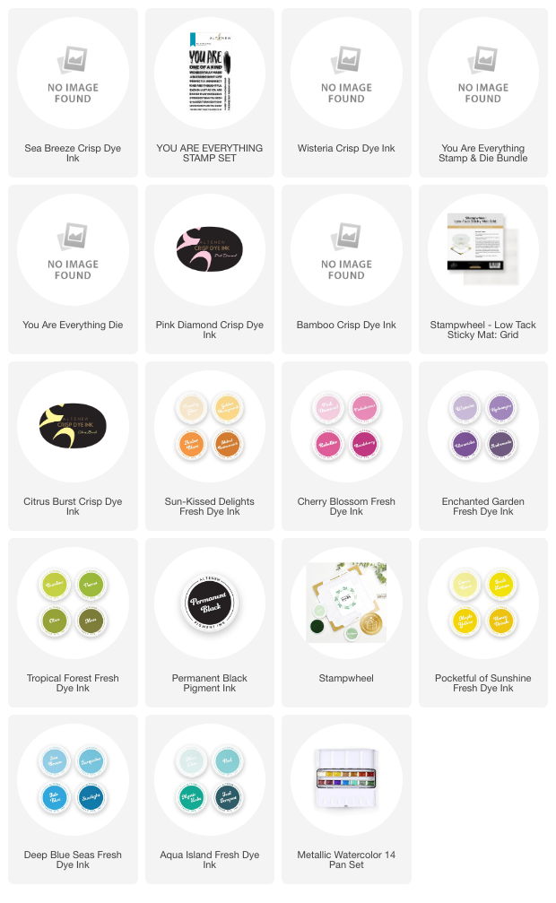
Down below you can find links to everything I have used. Some of the inks I wasn't able to link to individually but I have linked to the colour family they all came from so you can find them through those links. If you want to go for a darker rainbow, you can easily swap one of the colours I have used and go for one, or even two, shades darker. With Altenew's inks coming in a handy four shade ‘colour family' it's SO easy to pick one you like.
~Supply List~