From Summer to Autumn: Ink Blending the Strong Oak Stencil for Fall Cards
by Mindy Eggen September 12, 2025
Today’s card is all about transitioning From Summer to Autumn: Ink Blending the Strong Oak Stencil for Fall Cards.
Hi friends, Mindy here! I’m bringing back a previously released favorite, the Strong Oak stencil, and giving it a whole new seasonal, autumn twist. Instead of the fresh greens you might expect, I’ll be blending in rich autumn hues to create a tree full of warm, fall-inspired color.
This project is a fun reminder that with just a shift in your ink palette, you can completely transform the mood of your cards—perfect for celebrating the cozy change of seasons like autumn.

Let’s Start This Autumn Card Tutorial!
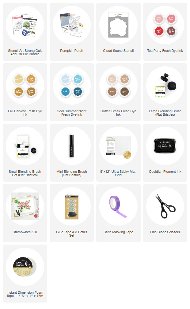
Starting with the layers for the autumn tree, I chose Coral Bliss from the Tea Party Set and Pumpkin Pie from the Fall Harvest Set. By overlapping these two shades, I was able to create a beautiful, warm orange that really rounds out the Fall color palette. To achieve a soft, seamless transition, I used my large blending brushes—they make it easy to cover bigger areas and get that smooth background blend that sets the tone for the entire card.

As I moved through each layer of the stencil, I deepened the colors by adding Yellow Ochre and Sicilian Amber from the Fall Harvest inks along with Heart Beat from the Tea Party inks. These shades brought in more depth and warmth, really giving the tree that rich, autumn feel.
To keep everything steady while blending, I used my 9x12 sticky mat to hold the cardstock in place. If the stencil needed a little extra security, a small piece of satin masking tape worked perfectly to keep it aligned without shifting.
To complete the image, I worked on the trunk and branches using Rocky Shore, Mocha, and Espresso from the Coffee Break set. These earthy tones balanced out the vibrant foliage and grounded the entire autumn design. For this step, I switched to a mix of small and mini blending brushes, which gave me better control over the tighter stencil areas and allowed me to build up those darker shades with precision.

Once all the blending was finished, I used the coordinating die to cut out the image. This step not only gives the design a crisp, finished edge but also adds more flexibility—I can easily move the tree around, pop it up with foam tape for dimension, or layer it over different backgrounds to change the look.
To tie everything into a scene, I brought in the Cloud Scene Stencil and blended with Sea Glass ink from the Cool Summer Night collection using a large blending brush. The soft edges of the ink blending created a watercolor-like effect, adding subtle movement to the background while also grounding the tree image. This simple detail really helps the design feel cohesive and gives the finished autumn card a more polished, scenic look.
Completing the Autumn Theme
To finish off the Fall theme, I stamped a sentiment from the Pumpkin Patch Stamp Set in crisp Obsidian Ink, then used the coordinating die to cut it out. With the pieces ready, I popped up both the tree and sentiment using foam tape and layered them onto the card front over the Cloud Scene stencil background. The added dimension really makes the elements stand out, while keeping the focus on that warm, autumn-inspired design.
By simply changing up the ink colors, I was able to take the Strong Oak stencil from a bright summer look to a cozy autumn scene. The warm blends of coral, pumpkin, amber, and deep browns, paired with a soft cloud background, created the perfect seasonal transition.
I love how versatile stencils can be when you experiment with different palettes, and this project is a great reminder that one product can give you endless possibilities.

SUPPLIES