3 Mistakes I Made in My New Sketchbook (and How I Fixed Them) | Perfect Pairings with Jaycee

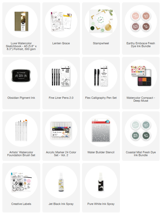
Hi everyone, and welcome back! Today’s Perfect Pairing is a little different. Instead of a pristine, perfect project, I’m taking you along for a "recovery mission." We’ve all been there: you open a brand-new, A5 Luxe Watercolor Sketchbook, and the fear of ruining that first page is paralyzing.
I decided to rip the bandaid off and dive into a mixed-media spread using the Lenten Grace Stamp and Stencil Bundle. Along the way, I made three distinct "boo-boos" or mistakes. Whether you are journaling or card making, these "saves" will help you trust the process!

We're diving into the details in this blog, but feel free to take a look at the video over on Altenew's YouTube channel too!
Mistake 1: The "Ugly" First Impression
When I went to stamp the large hellebore cluster with Earthy Rose Fresh Dye Ink, the uneven surface of the new sketchbook signatures caused a blurred, messy impression. It was literally the first thing I did, and it was ugly.
The Fix: I didn’t tear the page out! First, I used my BetterPress platform underneath the page to create a sturdy, level stamping surface. Then, I switched to Obsidian Pigment Ink for a crisp, bold outline. To hide the "ghosting" of the failed pink ink, I used a Flex Calligraphy Pen to create varying line weights. The thicker lines masked the mistake perfectly and gave the flowers a beautiful, graphic look.

Mistake 2: The "Watery Stencil" Bleed
I wanted an unconventional approach to coloring, so I reached for the Watercolor Compact - Deep Muse. Using a ¾ Angled brush, I tried to paint through the stencils. Because my wash was too wet, the pigment traveled right under the stencil, blurring my crisp lines.
The Fix: I pivoted to a "dry brush" technique. By using just enough water to hydrate the pigment and blotting the excess, I was able to capture the texture of the watercolor paper without the bleed. I then layered Acrylic Marker 24 Color Set - Vol. 2 on top to add directional strokes. This covered the messy edges and added a stunning, impressionistic feel to the petals.

Mistake 3: The "Over-Confident" Splatter
I was so happy with how the spread was coming together that I got a little too ambitious with my Jet Black Ink Spray. I ended up splatting a huge drop of ink right over my "Grateful" sentiment from the Creative Labels set.
The Fix: Geometric masking! I used a Fine Liner Pen to draw bold blocks around the sentiment. This "shortened" the phrase but kept the meaning, and the geometric shapes ended up tying in perfectly with the other "X" stamps and elements on the page.

The Final Reveal
Looking at this spread now, you’d never know it started with a mini-panic attack. By the time I added my cat photos and final journaling, those "oops" moments just became layers of the story.
The Lesson: Don’t let the fear of a mistake stop you from starting. Your "fixes" might just end up being your favorite part of the project!

1 Comment
I have a fear of messing up journals. This post was very helpful. Thanks Jaycee!
Leave a Reply