Unlock Harmonious Cards: Stencil with Analogous Colors | Perfect Pairings with Jaycee
by Jaycee Gaspar May 12, 2025

Hey there Altenew friends, welcome back to another Perfect Pairings with Jaycee. Are you tired of your beautiful, stenciled cards looking a little… off? Do you struggle to pick colors that truly work together, sometimes ending up with a muddy mess instead of a masterpiece? You're not alone! Choosing the right colors can be one of the biggest hurdles in card making.
But what if there was a simple secret to creating perfectly harmonized stenciled cards every time? There is, and it lies in the magic of color theory, specifically using analogous colors for card making. In this post, we're going to dive into this easy-to-understand concept and show you how it can transform your stenciling projects. Get ready to create stunning cards that everyone will admire!

Watch the video HERE.


What Exactly Are Analogous Colors?
Let's keep it simple! Analogous colors are simply colors that sit right next to each other on the color wheel. Think of them as friendly neighbors. For example, red, red-orange, and orange are analogous colors. So are blue, blue-green, and green.
Why do they work so well together? Because they share a common color (like red in the first example, or blue in the second). This shared hue creates a natural sense of harmony and flow, making them incredibly pleasing to the eye.

Why Use Analogous Colors for Your Stenciled Cards?
Using analogous colors for card making offers a ton of benefits, especially when you're working with stencils:
Subtle Variations: You can create beautiful gradients and subtle shifts in color within your stenciled areas, adding a touch of sophistication.
Instant Harmony: They naturally create a cohesive and visually appealing look without much effort.
Easy Blending: Because they are close on the color wheel, analogous colors blend beautifully, making your stenciled designs look smooth and professional. No harsh lines or muddy transitions!
Adds Depth and Dimension: By using slightly different shades and tints within your analogous palette, you can easily create highlights and shadows, giving your stenciled elements more life.
Less Intimidating: If you're new to color theory, analogous colors are a fantastic starting point. It's much harder to make a mistake than with contrasting colors.

Using analogous colors for card making is a simple yet incredibly effective way to elevate your stenciled projects. By choosing colors that are naturally harmonious, you can create cards that are visually pleasing, easy to blend, and look beautifully professional.
Give it a try on your next stenciled card! You might be surprised at how easy it is to achieve stunning results.
What are your favorite analogous color combinations? Share your thoughts and questions in the comments below!
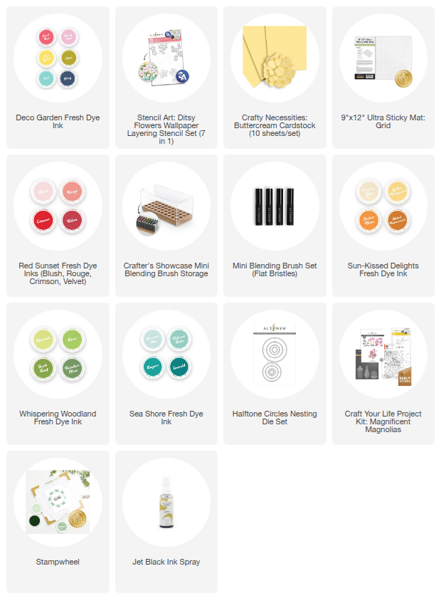
~Supply List~