Mastering Masculine Cards with Confidence
The Art of Masculine Card Making: Mastering Simple Shapes, Lines, and Color
Creating non-floral or masculine cards can be both fun and rewarding. By focusing on simple, clean design elements like lines, shapes, and a well-chosen color palette, you can create a card that is both striking and sophisticated.
Hey there, everyone, it's Jaycee with another Perfect Pairing. Let's dive into two card-making examples that show you how to do just that.
Card 1: Abstract Geometric Design

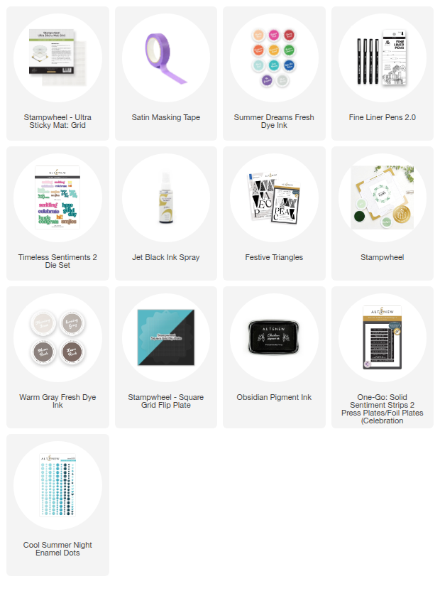
Shop the supplies used to make this card:
Summer Dreams Fresh Dye Ink, Timeless Sentiments 2 Die Set, Jet Black Ink Spray, Fine Liner Pens 2.0
This first card uses bold geometric shapes and lines to create a dynamic, modern background.
Step 1: Create a Bold, Inked Background
Start with a heavyweight white cardstock panel. Using a sticky mat and a mask (like satin masking tape or another piece of cardstock), create a clean, crisp line across the panel. Use a direct-to-paper technique to apply blocks of ink, creating textured stripes of color. For a cohesive look, choose analogous colors (colors that are next to each other on the color wheel), like yellow, green, and blue.
For a more layered look, you can move your mask and add lighter swipes of the same colors, creating different saturations and adding depth to your design.
Step 2: Add Detail with Fine Lines
Once your ink is dry, use a ruler and a fine-liner pen to add a variety of lines—solid, dashed, or dotted—over your inked areas. This simple step adds texture and visual interest, drawing the eye across the card.
Step 3: Make Your Sentiment Stand Out
For a masculine card, a bold, simple sentiment is key. Choose a die set with a thick, impactful font. Cut the sentiment out from your background panel to create a negative space. Then, cut the same sentiment multiple times from a separate piece of cardstock, stack them together, and glue them into the negative space. This technique creates a raised, dimensional sentiment that feels substantial and professional.
Finish the card with a few splatters of black ink spray for a touch of artistic flair.
Card 2: Radial Starburst Pattern

Shop the supplies used to make this card:
Festive Triangles Stamp Set, One-Go: Solid Sentiment Strips 2 Press Plates/Foil Plates (Celebration Edition), Cool Summer Night Enamel Dots
This second card uses a repeating geometric stamp to create a powerful focal point.
Step 1: Stamp a Radial Pattern
Using a heavyweight white cardstock panel and a stamp wheel, center a geometric shape stamp (like a triangle). Stamp the image repeatedly in a radial pattern, rotating the cardstock with each impression. Using just one or two ink colors, like a light and dark gray, creates a clean, classic, and masculine feel. This starburst pattern serves as both the background and the main design element of the card.
Step 2: Simple and Strong Sentiment
Stamp a bold sentiment directly into the center of the radial pattern using a dark, pigmented ink. The clean text contrasts beautifully with the intricate pattern. You can also add a small, coordinating sentiment strip underneath for a layered look.
Step 3: Add Tactile Texture
To finish the card, add a few enamel dots or other small embellishments around the central design. These simple additions provide a nice tactile element and break up the flat surface of the card, adding another layer of interest.
By focusing on these core design principles—line, shape, and a purposeful color palette—you can easily create impactful, non-floral cards for any occasion. Give these techniques a try and see how you can transform your next project!

Need a little refresher on all things cardmaking terms? Altenew's Cardmaking Glossary is here to help! Check it out, and who knows, you might have a chance to rehash some crafting terms and learn new ones!