


Take Your Designs up a Notch with Texture and Details! | Tremendous Textures with Erica
One of the fun things about Press Plates is that you can't only use them with the BetterPress system, you can also hot foil, and add color or shimmer to the texture of the Press Plate. You can also use it simply as an embossing plate, and that's what I have done with the Essential Texture Delightfully Dotty Press Plate.
Hello Altenew friends and fans! It's your texture-loving gal Erica back on the Altenew blog and YouTube channel with one of my favorite makes in weeks. It's got all the ingredients that I love on one card, and one thing I struggle with, which is white space. You can get lots more information in the video I made for you guys HERE!
I do have a great antidote to white space, which is fabulous texture. It works a treat to counteract the naked feel I get when I look at blank white space. Texture is pretty much the answer to all my crafting questions, lol.

As seen above in the photo, this fun dotty pattern is simple, but so versatile. I don't think it needs any ink at all, that texture alone is just fab. Saying that, of course, I will hot foil with it at the earliest opportunity.
I have done two panels, and one of them I have cut in half, on a diagonal. On the back of the cut piece I have added Instant Dimension Foam Tape to add some layers to all that delicious texture, but I made sure to keep the upper part free of the foam tape as I wanted to have my Gladiolus flowers and greenery poking out of the 'box' this created.
For the Craft-A-Flower Gladiolus Layering Die Set, I have used as close to the colored card stock suggested on the back of the packaging as possible. There were a few colors I had to substitute because I didn't have the one suggested, however, I think it worked out great anyway.

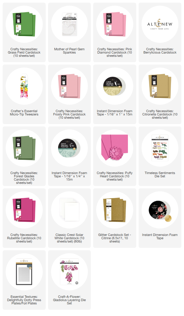
The colors I used are Berrylicious, Rubellite, Puffy Heart, Pink Diamond, Frosty Pink, Citronella, Grass Field, and Forest Glades.
Colored cardstock is fabulous for when you want to put together these layering die-cuts quickly and don't have time to add color another way. Some might worry they will look a bit flat as one color only, but the patterns of each die-cut will add enough texture and detail to them that they will be anything but boring!
I was determined to use the colors as directed on the back of the packaging, so it did take a little bit longer than just cutting them all out in the same color, but I think this step was well worth it.
After cutting them all out, it was a piece of cake putting them together thanks to the clever key hole system. These flowers also have a couple of different options for assembly, so you could essentially make five different flowers if you wanted to. We do like options, don't we?

After I had put all my flowers together, I played around with the layout on the background and then used some Press'n'seal over them. This stuff is absolutely great, and if you do a lot of diecut heavy cards, this should be a staple in your craft room. It ensures everything stays where you meant for it to go. The process of picking everything up, flipping this whole shebang over and adding glue or Instant Dimension Foam Tape is so quick and easy with Press'n'Seal!

See what I mean about the details and texture on the flowers? Even through the Press'n'Seal you can see it. Those little details really take these diecut flowers to a whole new level! There is a reason Altenew is one of the leading companies in the business, the attention to details is top notch.
The putting together of the card was slowed down a little by me getting a tad obsessed with that delicious texture on the backgrounds, but you know what? Admiring it gave me joy, so it was worth it. I also decided to not waste the other part from the panel
I cut it in half, and I thought it would be super cool to use that to die-cut a word sentiment out of. Unfortunately, the texture was flattened a bit from the die-cutting machine, but there is still some left. It's not completely flat, and the different texture from the background actually made it look really great.

I also thought it would be a gorgeous detail to layer the Thank You from Timeless Sentiments Die Set with Glitter Cardstock in Citrine. I also tried it layered with the words themselves in white card stock and the shadow part in the glitter card stock but it was just a smidge too big and covered up to much of that texture background, so I ended up just layering the words together and that was just the thing!

While it's subtle, they both have different texture and they compliment each other so well. This is another reason why I'm a bit advocate for trial and error, and puzzling. Sometimes the thing we think isn't going to work is the thing we end up liking the most! The glitter card stock has a great glittery (duh) texture, but doesn't shed!
I was very tempted to pop this up with Instant Dimension Foam Tape but decided to glue it down flush on the texture background, right below the flowers.
Of course we could have stopped there. It was a nice card at this point. But are we? No, definitely not. The whole point of today's post is taking things up a texture and sparkle notch! We are going to go straight to Bling Town, and the star of today is the Gem Sparkles in Mother Of Pearl!

If you watch the video you will see that I had another option I debated too, and a great tip on how to visual what will work best for your card. There is also another texture heavy card in the video, so make sure you check it out for a different CAF used for card no2.
Not everyone (read hardly anyone) uses as much bling and sparkle as I do, but I love how they also add texture to your card as well as the sparkle! It's a bling texture win-win, if you ask me. I have been rather generous with the gem sparkles here, as is my style, but obviously you do not have to go to the lengths that I do. I just love it, so I tend to Bring The Bling very often.

The reason I decided to use the Mother Of Pearls gem sparkles is because they have a beautiful iridescent shimmer, rather than a color, and that meant I could add a lot of them. The texture level is also insane as they blend into the whiteness of the background, but the tactile feel of them is great. I do love me some texture, sparkle, and bling.
There is no hiding that, and I hope you do too, and have found this post inspiring! Whether it is to use texture on white space, if you struggle with that like I do. Or if you just love bling and what to take your texture bling game up a notch. Remember, if you ever find yourself asking 'is this too much bling' just watch one of my videos and know you are in great company!

Well, that's it from this texture lunatic for today. With love and light, sparkle and creativity, layers and texture, and ALL THE BLING!
Your girl, Erica


Leave a comment