Different Inking Techniques with Embossing Folders | Tremendous Textures with Erica
by Erica Andersson October 22, 2025
Hi and welcome back to the Altenew blog! It's your color and texture crazy gal Erica, hi. Today we are going to combine the two. textures created with embossing folders and lots of colors thanks to the amazing array of ink colors available from the Altenew color 'library'.
First things first, make as many panels as you think you are going to need plus one or two extra. Just in case! Check the instructions on your diecutting machine how to achieve the best results, but if like me, your machine is hanging on for dear life, you can add a thin shim to your sandwich. I only need to add a piece of printer paper, folded in half, to get a much better impression.

Next up, the fun part! Grab some, or many, ink pads and go to town! I have used some of my favourite ink colours to create a bunch of different backgrounds, as well as some 'not very much my usual ink combos' to at least try and not be such a one-trick pony. I absolutely LOVE blue of all shades, and Starlight is one of my all-time favourites. Like hands down. Gold star, top spot, numero uno colour. I love it.
I have done a thing with the ink blending, that I now like to call 'tunnel ombré'. You ink blend around the edges of the panel, going quite dark on them and then easing the pressure and ink added as you move towards the middle. The idea is to create a colorful 'frame' of sorts. Does that make sense? It helps draw the eye in towards an image or sentiment.

Here the same thing has been done, but with Rubellite. A rich, deep pink colour. The great thing with this technique is that you don't need lots of colours, you can make do with just one actually. It does need to be slightly darker in shade, and you will need to use a liberal amount of patience.

Parrot, the ink colour used for this luscious green, is the second lightest shade in the Tropical Forest Fresh Dye ink bundle, so this took a bit longer to achieve than if I had used a shade darker.

So far we have three backgrounds, with fab colours and texture but we are not stopping here. Oh no.

As part of my self-imposed 'must try new colour combinations' thing, I decided to try three randomly selected ink colours for yet another background. The colours gave me slight anxiety at first, but it worked out in the end, I think! On top of the embossed pattern I have also gently rubbed the Platinum pigment ink pad to add some light shimmer to it. It looks really quite fab in real life.
When it comes to ways to add colours to a panel we all probably have our preferred ways, but I thought it would be interesting to show you three different ways.

From left to right we have a panel first embossed with the embossing folder and then had the colour ink blended over it. The middle panel was ink blended first and then embossed with the pattern facing upward. The right panel was ink blended first and then the pattern pressed into it, facing downwards. Depending on the look you prefer, hopefully this will save you wasting paper and just getting straight to the winning one.

If you want to save time and skip ink blending, use coloured card stock and one of the pigment ink pads to add a touch of shimmer to the embossed pattern. The panel above is done with Jet Black Crafty Necessities Colored Cardstock and Bronze Pigment Ink. So simple, yet so effective!

Obviously we need more than just fabulous backgrounds to create some cards, and the Serene Blooms set is prefect. It has two images to choose from, as well as coordinating layering stencils and diecuts.
The colours used for the flowers are the ones in the photo. I do love pinks and yellows for flowers, I seem to be a bit of a perpetual spring colour kind of gal when it comes to blooms. I'm not sorry about it though... I love these colours.

Remember how I mentioned that Starlight is my favourite blue? Well... seems I can't stop myself from using it on everything so I tried adding it to one of the Serene Blooms images too. I first heat embossed it in Platinum embossing powder, and then used a VERY light hand and not every single layer of the stencils to add a touch of blue to the image.

I also did another tulip stem in pinks and greens, the pinks are from my favourite pink ink bundle Cherry Blossom. It's a must have pink in my opinion.
I have also tried something fun with the vase/jug diecut that comes in the Serene Blooms diecut set. I have cut it out of various yardsticks, like white, black and Brushed Silver Metallic Cardstock. They look fab as they are, but I ran two of them through my diecutting machine with an embossing folder to see what that would look like. It looks FABULOUS if you ask me!!

When it came time to assemble the cards, it was pretty straightforward as I had backgrounds, images, sentiments and other little bits and pieces pretty much ready to go. The hardest part was not overthinking things too much and just focus on matching up each background with the best option of images, for a lovely contrast and pop of colour.
In the end I finished six cards, and while I tried doing one with a completely white background I decided to add a light touch of blue around the edges and then a sprinkling of silver water colour for shimmer. I don't know what it is about a completely white and plain background but I seem almost unable to do them.
Ok, sentiment wise there is a mix of them from the BAG Serene Blooms set, Timeless Sentiments, Timeless Sentiments 2 and Timeless Sentiments Holiday Edition. I have a little box with ready made sentiments, word die cuts and bits and pieces not used on previous projects so I 'shopped' this little box for a few ready-made ones.
Shockingly I have not used a single gem spark, enamel dot or sequin on these cards. I kind of wanted the colours and texture to be the star of the cards today. I hope you have enjoyed this post and will get the chance to watch the video as well. Let me know which one is your favourite and if you learnt a new way of adding color/texture from this!
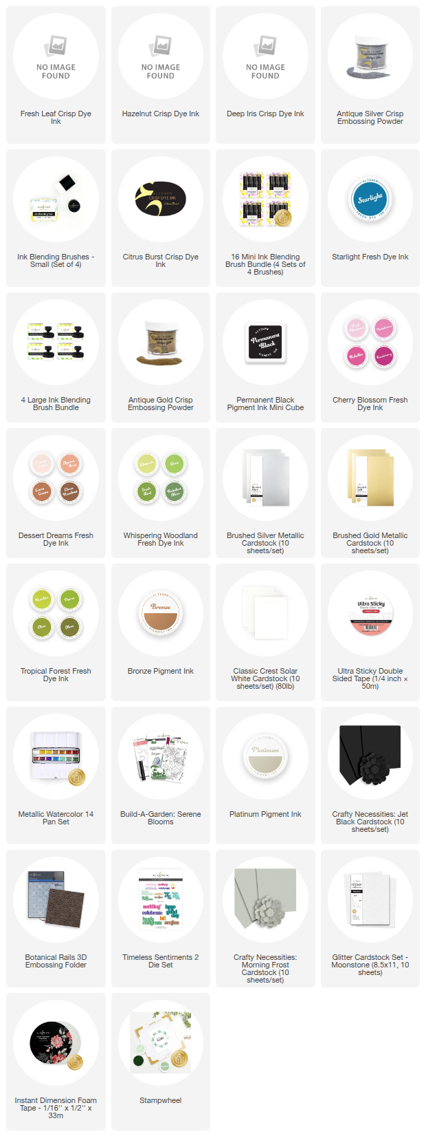
Just a heads up, we're having an amazing deal on all of Altenew's inks! Get up to 55% off on the entire collection including fresh dye inks, crisp dye inks, and pigment inks.
Don't forget to check it out, because this offer is only available from October 21, 2025 at 12:01 AM EST until October 23, 2025 at 11:59 PM EST. Shop HERE!