Architectural Elegance: Mastering Silhouette Harmony for Masculine Cards
When we think of "Gothic Arches" or "Arched Foliage," our minds often drift toward soft, romantic garden scenes. But today, I want to challenge that perspective. By leaning into Silhouette Harmony—the intentional echoing of shapes—we can transform these intricate designs into a bold, masculine scene with real structural presence.
In this episode of Perfect Pairings with Jaycee, we’re building a card from the ground up, moving from the weathered stone of an ancient castle to the rigid ironwork of a cathedral window.

We're diving into the masculine card details in this blog, but feel free to take a look at the video over on Altenew's YouTube channel too!
The Foundation: Creating Organic Texture
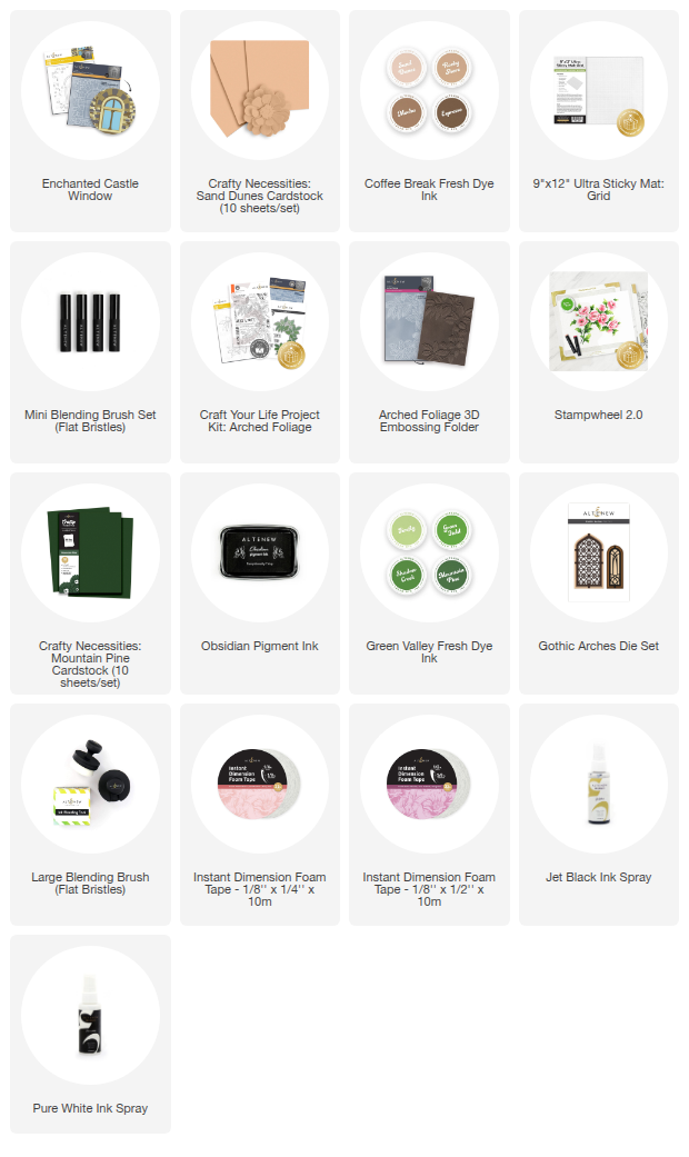
To start, I used the Enchanted Castle Window Embossing Folder and Stencil Set on Sand Dunes Cardstock. To give the stone wall a masculine, weathered look, I used a "pouncing" motion with my Coffee Break Fresh Dye Inks.
Pro-Tip: Don’t aim for smooth blends here. By stippling the ink onto the embossed stone, you create a bristled, gritty texture that looks much more realistic for stone elements. High contrast is your friend when building organic textures, and makes for beautiful masculine card designs too.

The Focal Point: Gothic Silhouette Harmony for Masculine Cards
The star of the show is the new Gothic Arches Die Set. These arches have a regal, geometric lattice that provides a strong "industrial" feel and is wonderful for masculine cards.
The breakthrough moment in this design is how the Gothic Arch fits within the Enchanted Castle Window. Even though they weren’t designed as a single set, their shared geometry is so precise that they create a seamless architectural frame. This is Silhouette Harmony in action—finding the "shape rhyme" between different products in your stash.

Grounding the Scene with "Architectural Greenery"
To balance the hard lines of the stone and metal, I brought in the Arched Foliage Project Kit.
The Technique: I stamped the foliage on Mountain Pine Cardstock using Obsidian Pigment Ink, then added tonal shadows using the layering stencils.
The Logic: In masculine design, greenery shouldn't feel like an afterthought. By using the Arched Foliage Embossing Folder, the leaves gain a physical weight that matches the stone wall.
When you mount the foliage at the base of the windows, it nestles into the frame perfectly. It grounds the architecture, giving the eye a logical place to rest.

The Final Touch: Intentional Sentiments
For the sentiment, I chose a simple "Hugs" from the Arched Foliage set. For masculine cards, I prefer short, punchy sentiments. They provide a typographic punch without overcrowding the scene.
I love how the sentiment is framed by the vertical lines of the window while simultaneously cradling the curve of the foliage. When your silhouettes are in harmony, every element—even the sentiment—has a designated home in this masculine card.
Final Thoughts:
Creating masculine cards doesn't mean you have to avoid intricate dies or foliage. It’s simply an easy shift in transition: swap flowers for stone, metal, and wood, and look for those harmonious silhouettes.
I hope this inspires you to look for the "hidden architecture" in your own stash!

Creating masculine cards and masculine designs is fun, and you can do it with different coloring mediums, too!
Buy the Deep Muse Watercolor Pan Set and get the Fine Watercolor Brush Set at 50% Off with code WTRCLR50! Don't dilly dally and get this soon, because the deal expires today, February 22, at 11:59 PM EST.

Supply List