Pairing Die-Cut Florals with Watercolors for a Moody Spring Look
Hello, fellow craft enthusiasts! Aga here, and I'm thrilled to dive into a project that perfectly bridges the delicate precision of die-cutting with the expressive, fluid beauty of watercolor. If you're looking to create handmade cards that stand out with depth and atmosphere, mastering this pairing is key. Today, we're focusing on how to achieve a captivating "Moody Spring" aesthetic using new products from the December release.
Die-Cuts and the Perfect Watercolor Palette
In the crafting world, the right tools can elevate a simple project into a masterpiece. For this card, I combined two incredible new additions that offer both structural beauty and rich, atmospheric color:
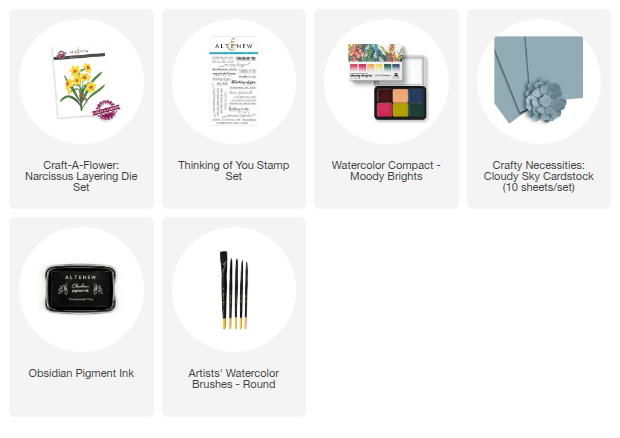
Craft-A-Flower: Narcissus Layering Die Set: This set perfectly captures the cheerful, yet sophisticated, energy of a spring favorite—the Narcissus. The layering system allows for stunning dimensional die-cut florals, providing the perfect canvas for our color work.
Watercolor Compact - Moody Brights: This is where the magic happens. This exquisite selection of six watercolor pans was created in collaboration with the immensely talented Sarah Simon (The Mint Gardener). It features a gorgeous, curated blend of saturated brights and rich, moody tones. This dual-tone range is absolutely perfect for creating both vibrant pops of color and the deep, atmospheric shades that make a project truly unique.

How To Create a Moody Spring-Inspired Card
Step 1: The Die-Cutting Foundation
I began by die-cutting all the intricate elements from the Craft-A-Flower: Narcissus Layering Die Set out of white cardstock.
Pro-Tip for Watercoloring Die-Cuts: Using white cardstock is crucial. It acts as a blank, pure canvas, allowing the true pigment and luminosity of your watercolor to shine through without being altered by the paper's underlying tone.
Step 2: Mindful Watercolor Application to the Elements
This is the core of the watercolor process. Instead of coloring the entire flower, I chose to be selective to achieve a high-contrast, moody effect:
-
Foliage Focus: I mixed a beautiful, natural shade for the leaves and stems using the green, blue, and a touch of yellow pigments from the Moody Brights watercolor pan.
Technique: I employed a wet-on-dry technique, applying clean water to the area first, and then dropping in the pigment. This allows the watercolor to naturally flow and blend, creating a variegated, organic look that mimics real plant life. I focused the deepest color near the base of the stems to create natural shadows.
The White Narcissus: To ensure the flowers truly popped against a darker background, I intentionally decided to keep the majority of the die-cut petals white. I only added a subtle wash of color to the centers. This high-contrast choice (white petals against colorful centers and foliage) is a key element of the "Moody" style.

Step 3: Assembly: The Magic of Layering
Thanks to the Craft-A-Flower’s clever keyhole system, the assembly process is quick, easy, and super fun. You simply stack the colored die-cut layers, creating a realistic, three-dimensional bloom. Allowing the watercolor to fully dry before assembly is vital to prevent smudging or bending the delicate paper.
Step 4: The Background’s Role in Setting the Mood
A moody setting requires a thoughtful background. I used a panel of Crafty Necessities: Cloudy Sky Cardstock.
.
Integrating Watercolor and Cardstock: While the main elements are painted, the cool, desaturated tone of the cardstock serves as a neutral yet atmospheric backdrop. It pulls the overall tone down just enough to make the die-cut watercolor elements—especially the bright centers—truly vibrant and focused. This technique is often more effective than painting the entire background, as it keeps the overall design clean and crisp.

Step 5: The Finishing Touch
To finish the card and provide a grounded focal point, I stamped a sentiment from the Thinking of You Stamp Set in black. The black sentiment anchors the design and provides the final piece of high contrast, complementing the moody palette perfectly.

I love how this card turned out—it strikes that perfect balance between the hopefulness of spring and the sophistication of a deeper color palette. The combination of the precise die-cut structure with the expressive flow of the watercolor creates a truly artistic piece of mail.
I hope this detailed breakdown inspires you to pick up your Watercolor Compact - Moody Brights and create your own cheerful spring designs with a captivating, moody twist. I personally can’t wait to see these beautiful little narcissus flowers blooming in my craft room and, soon enough, in the spring gardens!
Thank you so much for stopping by today! Happy crafting!

Want more? Join our FREE Live Watercolor Painting Class with Tasnim Ahmed on DEC 17th at 3:30 PM EST! Save the date & level up your artistry. Join HERE!